
Does anyone remember the old Tootsie Roll commercial from the 70’s? You know, the one that went “whatever it is I think I see, becomes a Tootsie Roll™ to me” (you can thank me later for putting that jingle back in your head).
There's been this ongoing discussion in the Juice office for a while about how good data visualizations are like Tootsie Rolls: they’re sweet, sticky, and wrapped in wax paper... um, not really (unless you’re Timo Elliot - thanks for the laugh, Timo; well played.) But we do believe that there are great data visualization lessons to be learned from what works in everyday life. We call these not-so-Fewian examples “Everyday Visualizations”. Everyday Visualizations are physical items that are arranged in such a way as to communicate some state or measurement of our surroundings. For instance, you might glance at a budding tree and "measure" that spring is just starting.
Well, the other day Frederica, one of our followers in Italy, sent us a few pics epitomizing some particularly thought provoking examples she noticed:

There are 5 people in line in front of me. (Thanks Frederica!)
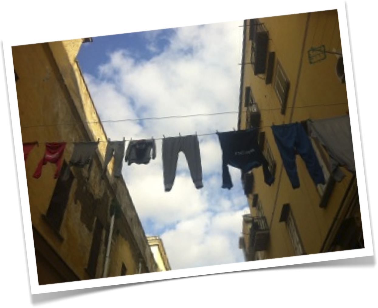
It’s not going to rain today in Naples, Italy.
These pics got us thinking again about all that can be learned from the everyday. As a result, we decided to post a few of the best examples we’ve seen. Here are a few we've collected over the months.
Everyday Visualizations in the Office
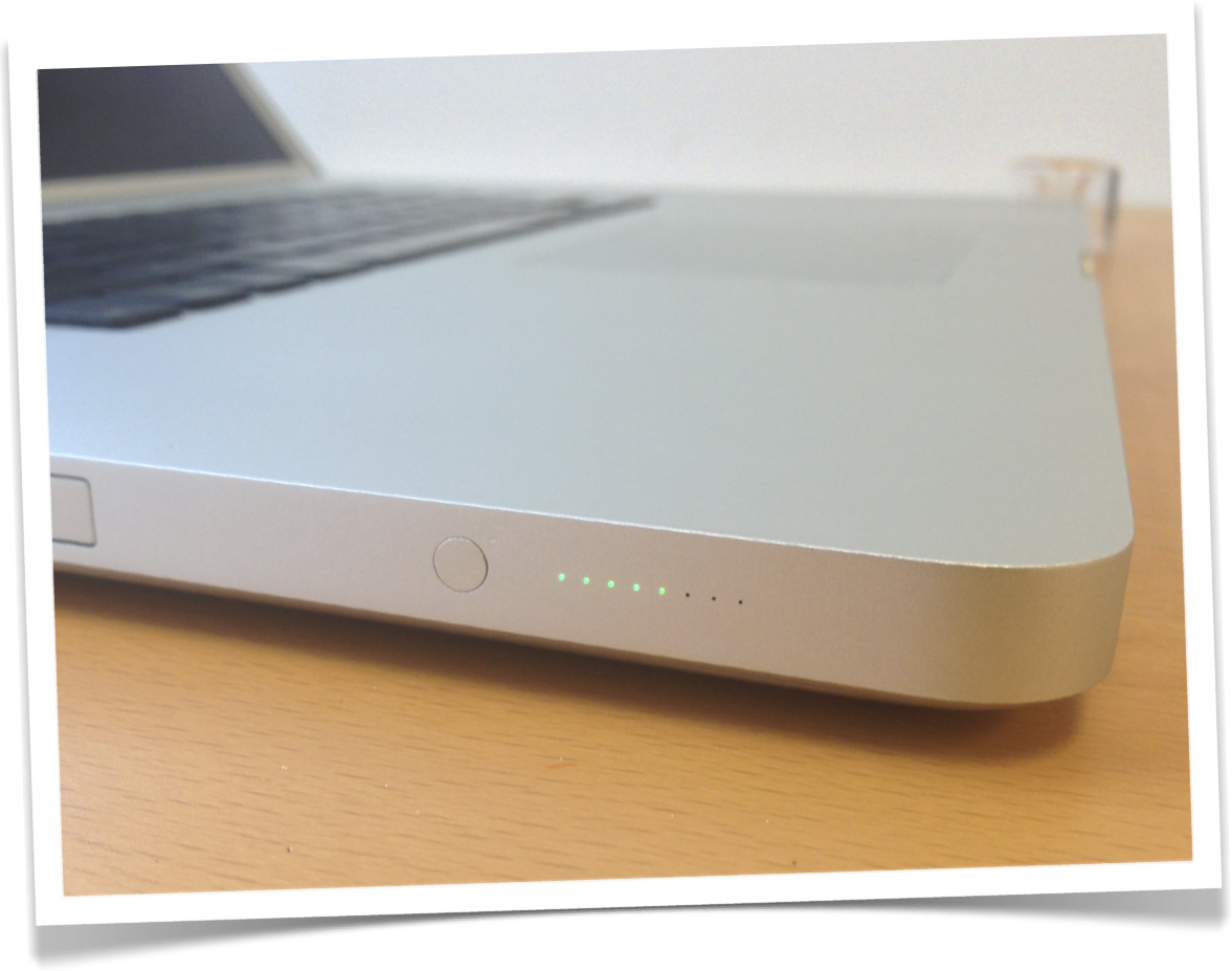
More than half a charge.
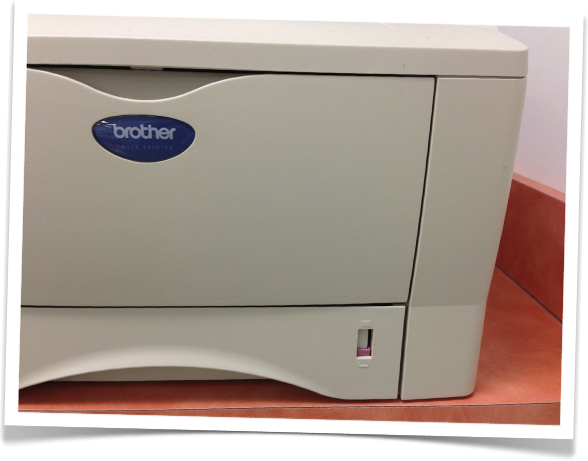
Phweww... I won’t have to reload paper... this time.
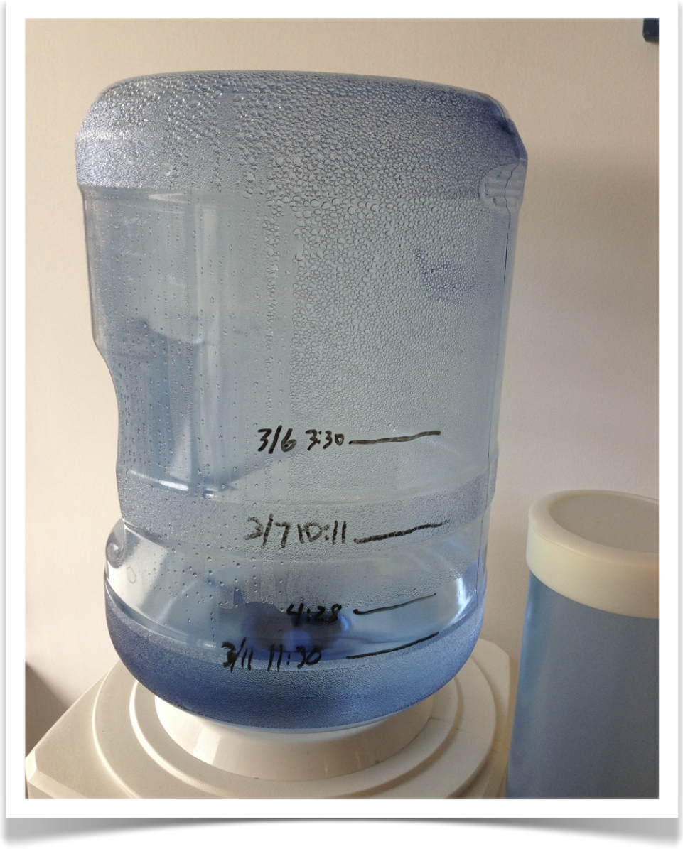
We’ll be on a new bottle by this time tomorrow.
Everyday Visualizations about food!
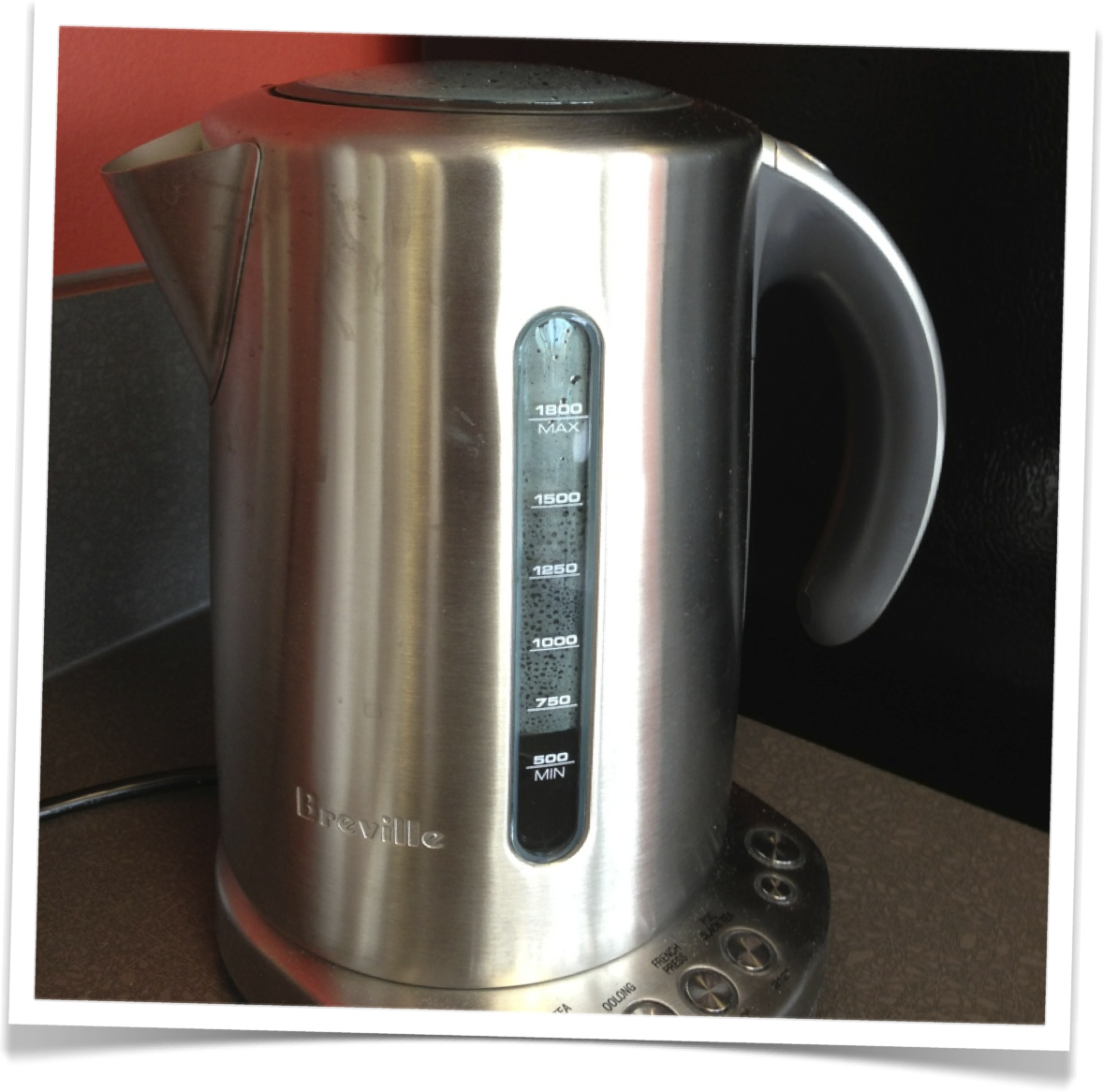
Just enough water for a cup of tea.
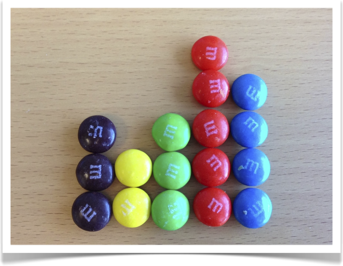
M&M’s I’m going to eat today.
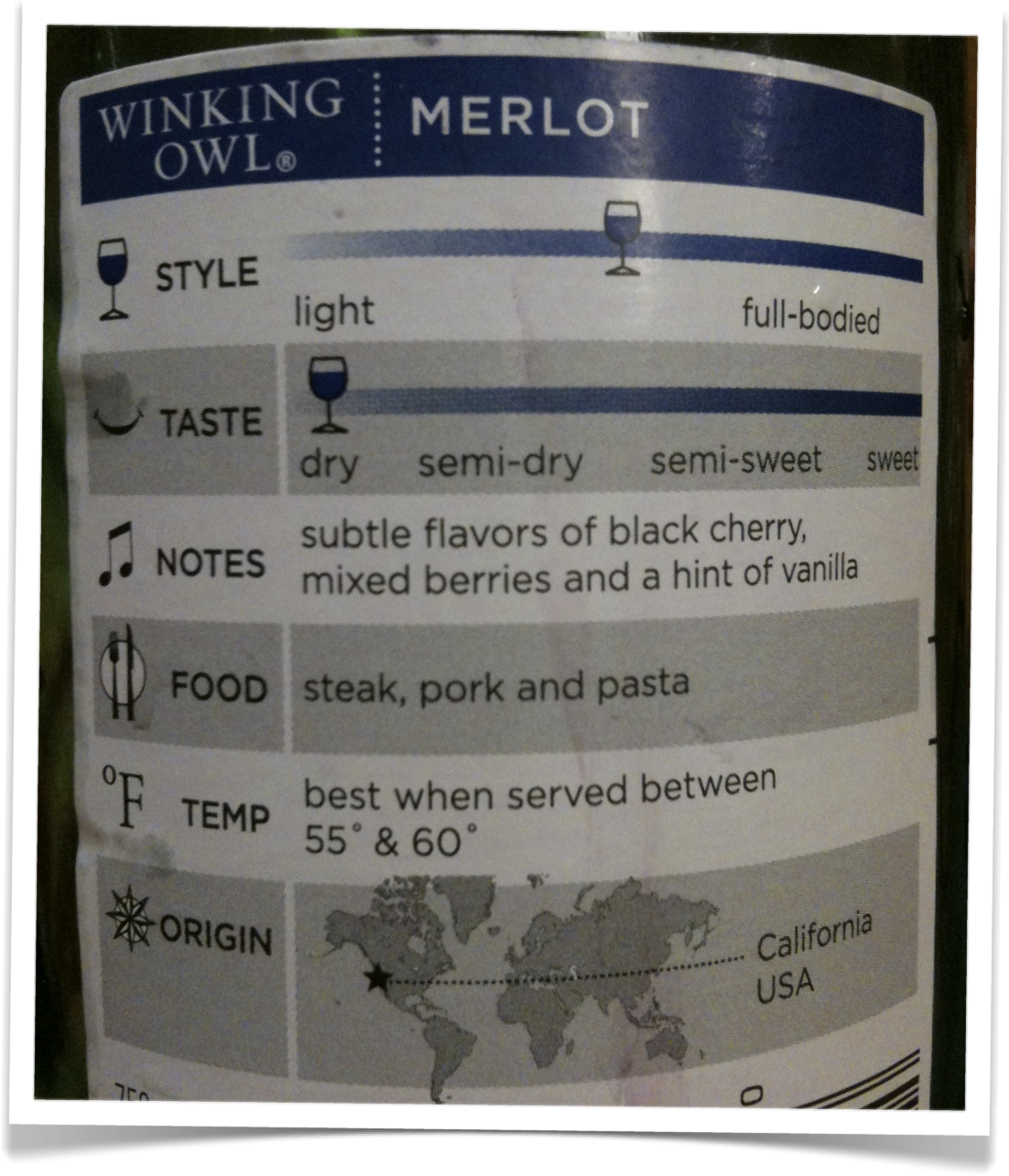
Viz-nerds like wine, too. (or is it: Wine-nerd like vis, too?)
(yep, that's right, we didn't include a single "pie" chart. ;-) )
What other categories can you think of where you see everyday visualizations? Weather? Traffic? Electricity? Send us some of your pics to info at juiceanaltyics dot com and we’ll post the best ones. Enjoy!