sports

Soccer needs some visualization love

Over the years you've seen a fewblogposts from the Juice Team on football, the American variety. We thought it made sense to give the world's most popular version of football a little love since the Major League Soccer (MLS) season just got underway. As we started our journey to pay tribute to the beautiful game, we came to realize much like the recent Sloan Sports Analytics Conference that fútbol is just starting to get its data on. Check out this view of team performance created in Slice.

MLS 2012 Season
MLS 2012 Season

This data comes from the MLS Soccer Team Stats page.

March Madness, Leaderboard-style

The Tournament is upon us. And if you know about picking a brackets, you know it comes down to match-ups, strong guard play, and choosing at least one 12-seed to beat a 5-seed. You also know the winner of your office pool will inevitably be that one non-basketball fan who picks teams based on mascots. Since we're bound for disappointment, why not have some fun with data. Our resident Iona grad, Michel, put together this slick Sliceboard that ranks the tournament teams by offensive and defensive stats. Notice how his school pours in 81 points a game as the 2nd most prolific offense in the tournament. They also manage to have the 2nd worst defense. Sorry Michel, defense wins Championships.

Offensive Leaders
Offensive Leaders

Who was that guy at the NFL Combine?

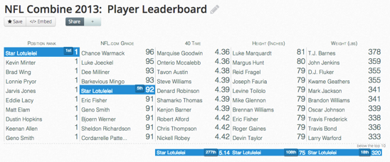
This weekend is the start of the NFL Combine. It is where roughly 300 of the top college football players show off the physical prowess, strength, speed, agility to NFL teams to help their status in the upcoming April draft. In case you end up catching a glance of the festivities and want to know a little bit more about the players, below you'll find a few visualizations that might help you learn a little about that player from Lehigh or the guy who did 38 bench presses of 225 lbs.

Use the search capability on each of these to find the player, position, conference or grade that you want to learn more about. We grabbed the data from NFL.com and CBSsports.com. Enjoy!

Leaderboard: Ranks players across multiple measures.

The Leaderboard ranks players across multiple measures

Comment View: Read quick summaries of players

NFL Combine Comments

Table: Search, sort, and find player details

NFL Combine Table
NFL Combine Table

NFL Rushing Tendencies Visualization...or Ahhhh, It's a Spider!

NFL-Spider-Viz
NFL-Spider-Viz

The mad scientists over in Juice Labs cooked up a new treat for you all just in time for Halloween Thanksgiving.  We’ve crossbred some NFL Data (courtesy of our fellow friend in data Brian Burke) with a visualization we’ve kept under wraps for a while called The Spider. Now before any of you that suffer from arachnophobia start to freak out, this isn’t the spider that you may be accustomed to.  The Spider visualization helps you understand the offensive rush tendencies for every NFL team for the last 4 seasons.  EVERY rush that ever happened in the NFL from 2008-2011 is captured in the visualization. Information about the average yards gained, total yards gained, and the number of plays in each direction are also included. You may be surprised to find out which direction the Green Bay Packers run to on 4th and inches or how unsuccessful Arian Foster has historically been running the football on 1st and long situations (he’s a pretty awesome RB otherwise). You can filter the data by week, season, down, distance, player, and/or the opposing defense. Try it out for yourself here for some deliciously filling insights.

How to Read the Chart: The thickness of the spider leg represents the number of rushes in that direction. A thicker line means more rushes were attempted to that area. The length of the spider leg stops on the average yards gained per rush in that direction. Click or hover over each leg for more detailed information about the team’s offensive rush tendencies.