Office of Research

The Jury's In: Findings from User Research

We made it our goal this summer to hear back from prospective users of our research application about how they would use the app to address various hypothetical issues in their day-to-day workflow. After asking a couple thousand departmental leaders to put themselves in situations that would lead them to use our app to address a need, we presented them with three different scenarios, ranging from grant proposal preparation to tenure decisions. We got some very interesting responses that we believe are applicable to how people use all different types of data products and reporting solutions. Here are our findings.

Benchmarks and Discussions - Specific to the research app, we found that when department heads go to write a grant proposal, they prefer to communicate with peers and use their peers' previously successful grant proposals as a benchmark of the quality that a particular sponsor expects from a proposal. 

Similarly, users of our Healthcare app also connect with their coworkers about training assessment and work performance. They too use their peers' experiences and expertise as a barometer for their own performance in training and in their work. Our chat feature that's built into Juicebox applications does a great job of facilitating discussions right in the app, so you can highlight metrics, share them, and start a conversation

Our chat feature in action

Our chat feature in action

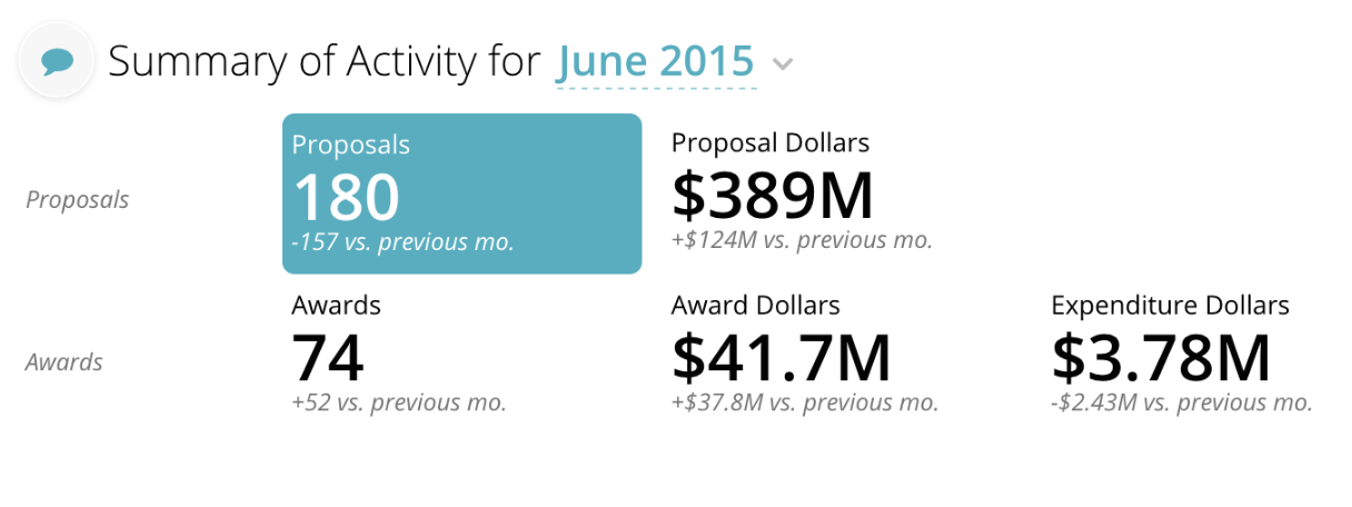
Performance Measurement - Specific to the research app, we found that department heads take their faculty's research activity very seriously. In fact, they consider a faculty member's research activity to have a greater influence on their promotion and tenure decision than teaching evaluations, service, and the opinions of other faculty members in their department.

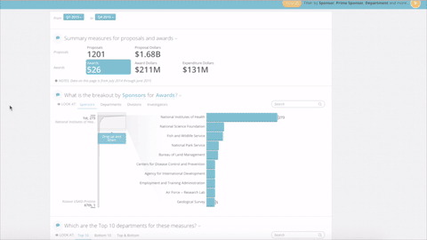
At Juice, we are no stranger to performance metrics. Managers in all types of industries use our apps to measure the performance of their employees for promotion decisions and general review purposes. We take measuring performance to the next level by giving our users seemingly unlimited ways to filter the data.

An example of research performance measurement

An example of research performance measurement

By listening to the needs and preferences of our users, we've created our apps to enable users to analyze peer performance within their institution and communicate with each other seamlessly. This takes the guesswork out of with whom to consult and what to seek from those data-enabled conversations. To get a taste of how you can get rich insights out of Juicebox, check out a quick demonstration of our research application or schedule a demo.  

Office of Research Application Preview

Imagine you're a researcher at a top university. In addition to conducting innovative projects, it's your job to work with research administrators to create proposals and receive funding. But how do you go about finding sponsors?

Our Juicebox Office of Research Applications removes the guesswork and makes it easy for researchers and administrators to communicate and successfully find sponsors and create grant proposals. Watch the video below for a quick taste of exactly how it works - from quickly sorting through information and making selections, to communicating with co-workers within the app.

Thirsty for more information? Send us your questions at info@juiceanalytics.com or for a more in-depth look schedule a personalized demonstration.

Choosing the Right Proposal Measure

Folks in the research administration community are talking more and more about data management and reporting at their respective universities. When we talk about data, we also need to talk about metrics. Tracey Robertson, the Director of Sponsored Research Accounting at Princeton University tells us that choosing the correct metric can:

  1. Change behavior
  2. Drive performance
  3. Support investments

Failing to choose the right metric to present research activity data will not only confuse people, but will also lead to missed opportunities and a failure to answer important questions that researchers and campus leaders may have.

A couple of years ago we wrote an article about using the right metric for your data presentations, and people really loved it. It’s summarized by this diagram:

However, we wanted to make it β€œreal” for our research community so we decided to give some more insight on how we used these concepts to design our office of research reporting application. Here’s what we came up with.

Actionable

To make a metric actionable, start by making sure it accurately addresses a real question or need. If your goal is to create a report on how successful a college or department is in getting funding for their proposals, your report would be lacking if you only included number of awards received in this performance metric. Why? Because this metric alone does not adequately capture proposal success. Including the number of proposals submitted as a reference to the number of awards granted captures the performance metric and accurately addresses the need. Here are the metrics we selected:

To enhance the actionability of these metrics, we also added the change from the previous month for each metric. In this example, for instance, the number of proposals was down 157 from the prior month. This gives the users some insight into context and hotspots for follow up action.

Additionally, when a user selects a metric, other information on the page (such as trend over time, or breakout by sponsor) is updated to reflect more detail on that selection. Interesting detail means action.

Common Interpretation

Your metric should be one that everyone can easily understand without much thought. Keep in mind that some (if not most) of the people to whom you are reporting your school’s funding data are not analytical experts. Think layman's terms here.

In the Research app, we made sure the labels of the metrics were simple, common and easily understandable. The labels β€œProposals” and β€œProposal Dollars” clearly represent what they mean and are common to the lexicon of our targeted users.

Additionally, we wanted to make sure there is a delineation between proposal and award metics by separating the key metrics into two representative rows, using the gestalt rules of association to connect the related metrics.

Accessible, Credible Data

A good metric is one that should be easily accessible and tenable. Many schools run into the issue of being able to track down and organize the data for their grant funding activity reporting.  

The platform that we used to create our research application (i.e., Juiceboxβ„’) is based on the premise of accessibility. But the credibility factor is tied to the data. Make sure that the data that you use to calculate your metrics is well understood and comes from a respected source. A good litmus test is to ask the question to your users: β€œIf you wanted to know the number of awards, where would you look to figure that out?” Your data source selection means more if people confirm your source as one they’re already trusting for their work.

Transparent, Simple Calculation

When an administrator, dean, or professor looks at the reported metrics, they should be able to recognize how your team reached that value and what it represents. If they cannot decipher how it was calculated you lose credibility and gain confusion.

The metrics we selected for our research application are what we call β€œsimple metrics” in that they are not complex assemblies of multiple metrics (otherwise known as composites, indexes, or franken-measures.) But to make sure the selected metrics are as simple as possible we narrowed them down to core concepts that people understand: the number of proposals and awards, and the dollars associated with proposals, awards and expenses β€” concepts most anyone in the research world readily understand.

Want to see more about useful proposal metrics?

We’ve taken the principles illustrated in this article and beyond and have applied them to our own product that can deliver accessible and actionable data insights to anyone who uses it. Check out the demo video.

Creating Annual Reports People Love to Read

It's no secret: annual reports are typically a pain to create and dull to read. They're one of the best opportunities we have to share everything we've done in the past year with people, so why is it that so often they fall flat?

We've found that there are a few things that can really make or break annual reports. Design, layout, and voice are just some of the things that all go into making annual reports that are not only easily understandable, but that people enjoy reading. A few weeks ago, we hosted a webinar (link to webinar at the bottom of the post) with our nine-and-a-half steps to making your data delicious and how to take your annual reports from "yuck" to "yum." Throughout the webinar, we surveyed attendees to get a better idea of their annual report practices and pains. Here's a breakdown of what we asked and the answers we received. They shed some light on current practices, and help to figure out what the future holds for annal reports.

Question 1: Does your annual report allow people to understand and act on the data?
We found that most people are dissatisfied to some extent with the clarity in their reports. It's not a new finding: confusion created by data has been discussed in multiple business and tech journal articles, and demonstrates the need for clear, concise, and direct communication in annual reports (skip to 6:22 in the video for more on using language effectively in reports).

Question 2: Is color used effectively?
If you're a long-time reader of the Juice blog, you'll know that color has meaning and is essential when sharing information. We found that most people use color in their annual reports, but realize that it's an important tool and want to know more about how best to utilize it. For more on the subject check out Juice's collection of design principles, many of which focus on color use in reporting.

Question 3: Do you see utility in using an online, interactive annual report?
The results of this question were overwhelming: attendees preferred online, interactive reporting over more traditional methods such as Excel or PowerPoint and printed reports. While there are different pros and cons to making the switch to online annual reports, it's important to note that in a few years online annual reports could be the standard (see more on the subject by skipping to 29:20).

If you'd like to talk more about annual reports, or data reporting in general, we're always around to chat. Take a look at your schedule and set up a time that works for you, or send us a message at info@juiceanalytics.com. Happy reporting!

Research Admin Survey Says...

A few weeks back, we surveyed university research administrators to get a better feel for their reporting practices and the types of tools they that use to communicate. Take a look at the results, and share in the comments below what surprised you most about the findings.

The survey results offer a glimpse into the Office of Sponsored Research's reporting process, effort and current tools. The survey results are from 84 different U.S. universities and 2 private research facilities compiled in the first quarter of 2016. They are a mix of 40% Public and 60% Private institutions.

Demo of Self Service Reporting for Offices of Sponsored Research

Research universities administer hundreds of research proposals and awards.  As a result, research administrators receive a comparable number of report requests on proposals, awards, expenditures and researchers.   While electronic research administration (ERA) systems have great data and offer reporting, these systems don't always make data easily available or in an easy to consume format for college leaders and sponsors.  As a result, there's a lot of effort spent packaging the data and making reports more presentable.

Here's a brief video (< 1 minute) showing what Research Self Service Reporting powered by Juicebox looks like and how it engages users.

Like what you see of the Research Self Service Reporting?


Self Service Reporting of Research Activity for Campus Leaders

Here's a recent webinar with Notre Dame's Office of Research sharing and discussing how they're using the Juicebox platform to implement self service reporting and automate their sharing of information with campus leaders.

A 30 minute webinar of Notre Dame's Director of Business Intelligence, Terri Hall, describing how they use Juicebox to provide self-service reporting to their users.

To learn more about Notre Dame's implementation of Juicebox, download the case study.