Information Experience

Design Tips for Non-Designers

Although I am not a designer, I have learned much about design over the last several years. Over the past year I’ve compiled this list of items for non-designers or people who work with designers.  Its intent is to give those of us that work increasingly with dashboard or information designers greater fluency in our conversations with designers.    

Creating this list took on a new urgency for me after reading this article on IBM’s design strategy.  I knew there would be more folks like me needing some ideas on how to understand, communicate and lead designers.

While there are many great sources of design, web design, information design and data storytelling, the following items are what spoke to me in the simplest terms possible. I divided them into sections and recommend reading or doing the sections in sequence as they build on each other. The Tufte course, in the major section, requires a day’s time and costs money, but is well worth it. 

If you get beyond this list check out these other sites Storytelling with Data, Visualising Data or Flowing Data to see some of what you learned being practiced or peruse Juice's design principles  under Learning and Resources to build on what you've learned. None of this will make you a designer, but your conversations with designers will be so much more fruitful. Enjoy. 

The Cost of Status Quo

Three years ago when traveling in another city, you most likely called a cab and waited for it to show up. Today, you use the Uber app, request a driver, and watch it on the map until it arrives.  No more ride refusals, broken credit card machines, or mysteriously long waits.   The taxi system relied on the status quo for too long and now Uber is making them pay for it.  

Think about the information you deliver to customers. When was the last time it changed? Have you and your reports fallen prey to the status quo?   

Doing nothing is always an option, but it’s never a no-risk proposition.  At some point in time, the status quo becomes more risky. When it comes to displaying information for customers, here are some thoughts on identifying whether the status quo has become too risky and it’s time to make some changes.

User logins are on the decline.

Users are using the information you provide less and less. Perhaps they’re using another source or not using anything anymore. When customers no longer need what you provide, you’re no different than a taxi in 2015.

Reporting comes up during contract renewals.

hen a customer explicitly brings up reporting as a reason they’re considering your competitor or wants to see report changes before they’ll renew, it gets no more obvious than this. Unless you’ve stopped listening to your sales team’s voicemails then this is a direct indication that you’ve relied on the status quo too long.  The fact you’re still using voicemail might be a clue too.  

Ad-hoc report requests are increasing

A good indicator that you’ve relied on the status quo too long is that the amount of support calls from customers for ad-hoc reports is increasing. Often, part of the financial justification for moving away from the status quo is baked into your on-going support costs.  Keep an eye on the number of tickets/requests you’re getting.  

Sales team wants to understand reporting

This is usually a big deal when the sales team takes an interest in reporting because really, why should they?  This means it’s coming up  more frequently in deal discussions, or existing customers are asking questions. Changing your sales team is more expensive than updating your reporting.

You’re pushing Excel and PowerPoint to their limits

You're using all the advanced functionality, elaborate macros, and pushing the tools to their limit and it still doesn’t satisfy customer reporting requests. When customers see the hourglass more than the data, or you have to stagger how many emails go out at a time, it’s probably time for an alternative solution.

This may sound discouraging on many fronts, but have hope. If you see yourself in any or all of these points, it means that you’re not alone and there’s a solution out there.  It’s the season of giving, and being generous with our time (and opinions) is something we love doing. At Juice, we’ve actually done the homework on the cost associated with status quo reporting. Feel free to reach out to us or schedule a quick call. We’re happy to offer a little free advice and give you some options other than the status quo.   


Make reports better, not just prettier

We hear from people contacting us as well as from other designers that often the design role in the dashboard project is to “just make it look pretty.”    

Well, pretty only gets you so far. Users may pause and stay longer than the typical 15 seconds on the page if pretty, but did they walk away with or accomplish what they wanted?  Do you want users or customers to say it was pretty or useful?

When delivering an information experience™ there are more important goals that outweigh pretty every time.  Here are just a few to consider when designing an information experience.

1. Be purposeful with design choices

Be really intentional on how you incorporate visual elements into your design.  When used with intent it tells the user to take notice of what you’re sharing.  

Use Color Intentionally - Color has meaning. It can communicate emotion, feeling. It can also draw your attention to certain things. To make sure you draw attention to the right things, it’s important to limit the amount of color you use. For example, see the example below.  While mostly grayscale, your eyes are drawn to the red.

                                             Image source: Information Dashboard Design, by Stephen Few

                                             Image source: Information Dashboard Design, by Stephen Few

Avoid information overload - Gradual reveal can be used to guide people through information, while still allowing them to explore.

Simple is best - Use the simplest appropriate visualization for the data you are presenting. Consider what question you are trying to answer and communicate that as quickly as you can with a simple visual that’s easy to understand.

2. Design for Action

Ideo in their September 2015 HBR article, Design for Action, highlight many examples of designing for action.  Much of what they cite is relevant to information displays as well. Some other things to keep in mind:

Integration with workflow - People need to work quickly and efficiently and if it takes too long to get to the information they need, they will move on. Think through your user or customers workflow and how your design can best integrate.

Provide next steps - Keep your users end goal in mind and help them get there. Give them meaningful next steps at appropriate times. In the example below, LinkedIn helps you with setting up your profile by letting you know how much has been completed and which items are still left to complete so you know what’s next.

There is certainly a place for beauty in your dashboard design.  As Chris G. notes in our frequently downloaded “Guide to Creating Dashboards People Love to Use”, “Modern web design has moved on to seek a union of utility, usability and beauty. We must find a similar union when displaying data in business.”  Note how beauty is equally partnered with utility and usability.  There should be a balance.

When designing reports or dashboards, strive for useful, helpful and understandable.  “Pretty” simply isn’t enough.

Offer Self-serve, not Self-solve

Imagine this: after months of waiting for the new dashboard with promises of “actionable insight” and “democratized data” you click on the link and silence.  A numb feeling takes over as you stare  at the buttons and drop-downs as if they were from a commercial airline cockpit and wonder, what do you do with these fancy things do?

As the pace of business quickens, customers need data solutions that are truly self service and not self solve. Organizations continue to deliver solutions masquerading as self service, which offer extreme levels of flexibility and put the burden of solving the problem on the user. There is no service reflected in these solutions. A data product or solution should make the value of the data and how to answer a user’s questions readily apparent to truly be self service.  

Much of what we see in the consumer marketplace isn’t self-serve, rather it is self-solve. Take for example Trunk Club, an online men’s clothing retailer, where it asks customers a few questions about lifestyle, work-life, budget and sizes. Then, Trunk Club becomes their personal shopper and puts together wardrobe options, mailing them directly to the customer each month. This is a self-serve approach.

self-serve-self-solve-data-dump.jpg

A self-solve experience, in contrast, will require more of your time.  The self-solve approach to clothing shopping is to turn buyers loose at the mall or on Ebay, where there is very little direction or guidance given to the shopper’s specific needs. Self-solve requires you to figure out the process yourself.   Self-solve involves an instruction manual or many rounds of trial and error.  

How do you know if your solution is self-solve or self-serve? Here are four clear points to help you distinguish the difference.

1. No Instruction Manual or Training Required. Remember the point of self-serve is to make life easier. Most users are not looking to invest more time, but less. Embed your training within the dashboard or application at key points.

2. Built to Answer Specific Questions. A self service solution is intended to answer specific questions. It’s not a means of just dumping information on someone.

3. Encourage vs. discourages exploration. While a long series of drop down menus may feel like it offers lots of exploration, it really doesn’t. Think of the paradox of choice. Offer a few options with interactivity, so the user sees immediately the fruits (or juice) of their efforts and wants to try more.

4. Make Steps Sequential. In the web analytics world you often want to see paths or steps the users took to make sure they’re guided down the intended flows. The same can be said for your dashboard. Make the flow or steps sequential and easy to follow.

What makes YOUR data powerful is creating an experience for the user that informs, instructs, and leads to smart discussions. Keep your audience engaged and deliver real value with a REAL self-serve solution. Don’t make them figure it out, because chances are, they won’t.

Review our design principles for a helpful guide and review examples of effective self-service models.

Schedule a demo to see how Juicebox can transform the information experience that your audience needs and values.


Not Knowing Where To Start

Books, movies and music all have a beginning. Data, when presented or shared, often does not have an intuitive starting point.  The challenge of not having a clear beginning is that when you see a dashboard littered with a dozen competing charts it’s easy to disengage. Tables of raw data can be even worse. Dashboards or reports are often designed to deliver everything and the kitchen sink.         

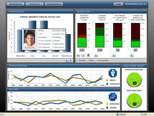
Here are a couple of examples of dashboards that miss the mark in terms of telling their audience where to start.  In both of these cases the user has to be familiar with the data and know how to read the information correctly.  Beginner or infrequent users will struggle to understand the value of this data.  Without guiding them, the users can lose interest and choose to avoid using the information altogether.

               http://www.dashboardzone.com/health-metrics-dashboard-from-idashboard

               http://www.dashboardzone.com/health-metrics-dashboard-from-idashboard

              http://www.informationbuilders.com/products/webfocus/operational_dashboard

              http://www.informationbuilders.com/products/webfocus/operational_dashboard

Good dashboards or reports start with a high-level summary and then let users progressively and logically drill into more complex details and context. They are also simple and uncluttered. They use white space and have a clear visual hierarchy.   Here are a few of alternative examples to get the wheels turning.                        

Even this more advanced interactive visualization, called a TreeMap, offers clarity on where to start and how to use it.

To have your audience follow your story it’s important to get them started on the right path.  Think Steven Covey’s, Begin with the End in Mind.  Just like a story your audience is along for the ride.  Carry them from initial explanation to a new, shared understanding.   Only then will they begin to value the effort you put into assembling and presenting the information you’ve given them.

For a demo of our product, Juicebox, schedule an appointment.

Find out more on effective data visualization from our book, Data Fluency. Excerpted here with permission from the publisher, Wiley, from Data Fluency: Empowering Your Organization with Effective Data Communication by Zach Gemignani, Chris Gemignani, Richard Galentino, Patrick Schuermann.  Copyright © 2014.


The Last Mile of Business Intelligence (Revisited)

Here’s another re-juice-inated blog post from years ago. Unfortunately, or perhaps fortunately for us, even after almost eight years, we’re still in the last mile. Even today, with Tableau’s huge success and so many data analytics startups, we still see organizations struggle to turn information into insights for their every day decision makers.

Here is Zach’s post from November 2007:


“The last mile” is a term that often is applied in the telecom industry in reference to “the final leg of delivering connectivity from a communications provider to a customer.” It is an expensive and complex step due to the challenge of pushing information from centralized, high capacity channels to many diverse end-points where information is ultimately used.

We think there is a “last mile” problem in business intelligence too. This critical bridge between data warehouses and communication of insights to decision-makers is often weak or missing. Your investments and meticulous efforts to create a central infrastructure can become worthless without effective delivery to end-users. “But how about my reporting interface?” you wonder. That’s a creaky and narrow bridge to rely on for the last mile of business intelligence.

Listening to our clients, we are confident the last mile is a real problem. The ultimate source of this failure is less clear. Here are a few of theories:

1. The engineers who built the data warehouse build the interface. No offense to the talented individuals who can push around, clean, normalize, and integrate data—but they may not be ideally suited to designing a user interface for non-technical users. A designer wouldn’t create charts that look like this (our favorite example of chart-based encryption):

In the worst case, developers are dismissive of user experience. I’ve met with IT folks who felt confident that providing a massive data table would provide a suitable solution for delivering information to users. “Hey, they’re getting their data. Is there a problem?”

2. Reporting is considered the fundamental mechanism for working with data. Here’s a framework we’ve started to consider in thinking through the multiple approaches for getting value from data:

  • Reporting lets you monitor things that are well-understood and relatively predictable.

  • Exporation or analysis helps you understand new processes and erratic and shifting behaviors.

  • Presentation is about communicating insights and understanding, often building on both reporting and analysis.

Many people assume that a reporting tool is sufficient to do in-depth analysis and communicate results. That’s like trying to build a deck with a screwdriver.

3. Poor fundamentals in information display. Despite the efforts of folks like Edward Tufte and Stephen Few, general literacy in this area is still low. Shiny, 3D pie charts are still acceptable, even desirable in some places. Particularly disturbing is the persistence and pervasiveness of this problem in Excel where there still remains some confusion as to why this is bad information display:

You don’t have to go any further than the Dashboard Spy to find examples of the visual muck that is commonplace.

The Consequence of Using Visualization Incorrectly

Data visualization can be a powerful tool when leveraged effectively, but what really happens when it’s done poorly? Well, how about a confused user? What about unnecessary support calls or just more meetings to explain what you’re trying to say?

Correct visuals help others understand the data and what it's telling them. When done well it’s like a whole new set of vocabulary for conveying your message. The reasons to avoid poorly presented information and investing in the time to do it right are as follows:

1. It can not only mislead, but lead people to the wrong decisions.

Misleading data can be completely unintentional, but no less damaging. When important data is left out of the visual, it leaves you open to making the wrong decision.

One thing to be aware of is whether or not certain data exists. There are times that specific data isn’t available and it’s important to know if you can get access to it or not. Missing data can lead to misunderstanding.

To make sure that you don’t mislead, start by thinking about your goals. What information is needed to make an accurate decision? Once you know what information you need and what data is available, think about the relationships between data points. Are those vital to understanding? If so, consider visuals that accurately display those relationships so that informed decisions can be made.

Also be sure that whatever visual you use has the right scale. Scale can easily distort information. It can also hide outliers that could actually be important data points to consider as context.

2. It can delay decision making, i.e. “not sure what this says, will look at it later.”

One of the biggest culprits of this problem is choosing the wrong visual. If you are trying to show relationships between data points, but use a bar chart instead of a scatterplot, it’ll take a lot of work to figure out where the relationships exist and what effect they have.

Also be sure to consider your audience. If they are more well versed in visualization, they may benefit from the use of more advanced visuals. But if not, keep it simple rather than alienating people.

The other culprit can be displaying too much or too little information. With too little information, your audience may be left wondering what the main point is and feeling like they need more information to form an opinion. With too much information, data can be overly complicated or cluttered and make it difficult to focus on the real story.

3. It can disengage some of your audience.

When visuals are confusing or difficult to follow or understand, users will trail off. They may decide to come back when they have more time to spend to “figure it out” or they may give up entirely. Neither is going to give you the results you want and can result in delayed, or misinformed, decisions. Some reasons that your audience might disengage are similar to issues above - a confusing visual, too little or too much information.

Ultimately you need to make sure your story is clear and easy to follow. Using visualizations incorrectly can cause you to lose your audience, lose the value in your data and ultimately lead to poor decision making.

For help with effective design and visualization, be sure to check out our design principles, particularly the sections on “guidance” and “audience-centric”.

Emotional Dashboards - Moving from confused to happy customers

Just like hearing that popular song from high school can elicit certain emotions, so too can a dashboard. Intuitively, the words “emotional” and “dashboards” don’t appear to go together. However, it's not difficult to imagine some four letter words being thrown around because “the numbers don’t make sense” or because your audience is frustrated that they can’t understand what you’re trying to say.

Sound familiar? When dashboards do not connect for your audience this is the sad intersection of lost clients, wasted time and dollars.

Today’s dashboards have the power to do more and be more than their predecessors. Just as modern web/application design marry utility, usability, mobility and beauty, so the same can be said for our information displays. Your organization’s data, when presented correctly, should command attention, start a conversation, compel action AND strike the right emotion.

How do you trigger the right emotions with a dashboard?

Frustration #1: Which information is most important!

Unfortunately, more often than not the heart of the designer’s message is lost among all the metrics and chart. In this flurry of enthusiasm to get something done, little attention is paid to guiding the user on how to consume the information, so they get what they need. Take a second look at your dashboard and ask what should be the first thing they see? Will they know it’s the most important.

Frustration #2: There’s too much detail!

Don't get caught in the myth that more is better. Your users probably have other responsibilities other than looking at your work all day. Give them the high-level path to follow, and let those users who need more info have the option to drill down into the details which can be collapsed under the high-level data point, or linked to an appendix, or included in separate report.

Frustration #3: The dashboard looks like Gaudi made it!

Overzealous graphics, too much color, images, etc can cause more harm then good.  Don’t get us wrong, Gaudi was an amazing artist, but, when displaying valuable analyses save your modernism impressions for some other endeavor. Be purposeful in how you use these elements.

There is no need to let those emotions go unchecked when it comes to displaying your dashboard results. To ensure you are triggering the right emotions and ensuring your dashboards are delicious, Download the emotion-filled Juice white paper “Designing Dashboards People Love”. Just updated to reflect the latest in Data Fluency.


The Myth of Flexible Reporting

Flexibility is essential, no doubt, to navigate life and work. Yet, flexibility is not always what is needed. Take for instance this NY Times Article, Too Many Choices: A Problem That Can Paralyze, which states that when we are faced with more options we tend to shut down or make decisions against our best interest. Often times, especially when dealing with data or making decisions, more flexibility is less helpful. It actually works against us in terms of work efficiency and cognitive load. When displaying information to the everyday decision maker, offering them the single best raisin bran choice vs. a list of choices is always best.

So what does this mean for your information sharing and reporting? Does your audience really want more reports or additional download options?

The answer is no. The myth in the reporting and dashboard world is that customers need or want more analytical flexibility and data. Sure there’s always some analyst that REALLY needs it, but more likely your buyer or end user wants your guidance on how to consume the information.   More choices always feels like a good idea on the surface until you begin to see the breakdown that occurs with users when they are drowning in reports or giving your interface that deer in the headlights stare. More reporting flexibility equals more support calls, more report requests, etc.

Here are a few reasons why your users might ask for more flexible reporting options. Be aware this is a HUGE opportunity for you to demonstrate your expertise with the data and guide them down the right path.

#1 Uncertainty - Your users aren’t really sure what they plan to do with the data, don’t know the problem they plan to solve or their business direction changes so often so they figure they need flexibility. This is an opportunity to show them the value of what’s in your data and the types of problems that can be solved. Provide certainty through instruction and guidance vs. feeding the uncertainty. This is a perfect opportunity to be a hero for customers like these.

#2 - Only one Shot -  Whether real or perceived, your customer perceives they only have one shot because of project timelines or budget reasons to solve for everything they need for the next 1+ years. In this case you need to teach them to be gourmets about the data and not think of it as a Vegas buffet. Getting every last bit of data won’t solve any problems. Help them solve a specific business problem with the data, in a timely manner (weeks not months). They will then have the credibility and leverage to ask for more resources. They’ll also have you to thank for it.

#3 - Do it myself - Do it Yourself (DIY) is fine. If they’re experts on your data and you have confidence in their capabilities and ability to come up with the right interpretation then let them go. However, be careful on this one. Often times it means that they don’t trust you to explain, guide or provide them the data they need or have asked for. Be sure to probe on this.  Has it happened right after you delivered a new set of reports? There are risks here of them coming up with the wrong interpretations or worse yet, you’re just a commodity provider of data.  

The place you want to be is like a personal shopper. You recommend, guide and instruct your users to the best path for them. If you just give them the cereal aisle, you’ll only be a cashier.  

When you guide them they know you care and are taking a REAL stake in helping them. Avoid the myth of flexible reporting. Check out Juice’s design principles, specifically the ones on guidance to offer up some ideas on how to implement guidance. As always, feel free to drop us a note with your thoughts or questions at info@juiceanalytics.com or tweet us @juiceanalytics.com.


Building Bridges from Academia to Business and Practice

Hey all – we have developed a great relationship with John Stasko, Associate Chair of the School of Interactive Computing program at Georgia Tech and the General Chair of the upcoming IEEE VIS 2013 conference. As we’ve talked with John, our conversations seem to always come around to the need for a tighter connection between academia and industry. As a result, we thought it’d be great to introduce John to our tribe through a guest post. Below are just some of the ways John is working to bring academia and industry together. Enjoy! 


Hello - I’m a professor at Georgia Tech and I’ve been working in the data visualization research area for over 20 years. My friends at Juice asked me to write a short guest blog entry providing perspectives from the academic data visualization community and exploring ways to foster more industry-academia collaboration. I’ve found that we don’t work together often enough, which is too bad because each side has a lot to offer to the other.

I personally have benefited from business collaborations in many ways. Since data visualization research is so problem-driven, industrial interaction provides an excellent way to learn about current problems and data challenges. In my graduate course on information visualization student teams design and implement semester-long data visualization projects. I encourage the teams to seek out real clients with data who want to understand it better. Some of the best projects over the years have resulted from topics suggested by colleagues working in industry. Additionally, I often employ guest lecturers such as the guys at Juice to come and speak with my students and provide their own insights about creating visualization solutions for clients.

I hope that in some ways my class is benefiting industry as well and helping to train the next generation of data visualization practitioners. Students learn about all the different visualization techniques and their particular strengths and limitations. They also get hands-on practice both designing visualizations for a variety of data sets and using current “best practice” tools and systems. The course has become a key piece of the Master’s degree in Human-Computer Interaction here at GT.

Another opportunity for interaction is academic research forums such as conferences and workshops. Coming up this October in Atlanta is IEEE VIS, the premier academic meeting for data visualization research. VIS consists of three conferences: Information Visualization (InfoVis), Visual Analytics Science & Technology (VAST), and Scientific Visualization (SciVis). Last fall, the meeting garnered over 1000 attendees for the first time.  VIS is an excellent forum to learn about the state of the art in data visualization research, see the latest systems from commercial vendors, and just rub elbows with like-minded friends and colleagues.  Recent papers at VIS presented tools such as Many Eyes and D3, introduced techniques such as Wordles and edge bundling, or just pondered topics such as storytelling and evaluation.  And the meeting has much more than just research papers – It also includes numerous workshops, tutorials, panels, and posters. This year for the first time we have added an “Industrial and Government Experiences Track”. This program is designed to highlight real world experiences designing, building, deploying and evaluating data visualizations. The presentation mode for this track will be posters on display throughout the meeting with multiple focused interaction sessions. Each submission should include a 2-page abstract about the project and a draft of the poster. They are due on June 27th.  More details about the track can be found on the meeting home page.

I hope to see many of you at VIS in October here in Atlanta!