
Description
When providing the next steps for a user in an application, it is important to keep the end goal in mind. The challenge is that goal can be very different for each person. To avoid overwhelming the user with too many options, predict logical next steps at meaningful points in time.
There are multiple ways to organize how a user attains information and which method to use is based on how linear or fluid the path to the end goal is. For a linear, sequential path, there would always be a specific next step that must be taken. To lead the user to the next step, a clearly labeled button or input component would be necessary. You don’t want to make the next step difficult to find or get to.
An example of this would be something like a Travel booking site, such as Travelocity, or an online shopping site. There are clear steps laid out for the person making the purchase – find the product you want to buy, select the product, decide which options you want included (quantity, color, etc), give your shipping and billing information and whalah! You’ve followed the steps to reach your goal of buying something.
For a less linear path to completing a goal, it’s necessary to organize the information well and provide clear guidance to the next possible steps. To know what steps to guide them to, think of the goal. Are there multiple factors affecting the ability to attain that goal? If so, direct the user to those different factors. You could even rank the usefulness of the different options to guide the user to what would have the most impact up front, or to show them a logical order, though they may not want to follow it.
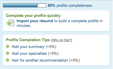
For example, on LinkedIn when you are setting up your profile, there is a section where it lets you know how much of your profile is complete and gives you suggestions of different ways to complete your profile and make your profile more attractive to other professionals.
In a data visualization context, if you are looking at sales goals and sales numbers, you can try to point the user to information about their productivity that will inform on ways to have their sales numbers match their goals. Maybe there is a stronger correlation between the number of sales calls made and sales results than between the number emails sent and resulting sales. Showing a ranking of the various things that can be done to reach a goal not only provides a next step for the user, but provides some context for which step to take next.
Examples
Poor usage: After opening this program, the very first thing I saw was a prompt asking me a very specific question. At this point I hardly, knew what the program was for, let alone what my camera’s frequency should be and if that mattered.

Source: ASUS Lifeframe
Good usage: Here is a familiar process, done perhaps better than you’re familiar with. This is a very linear process keeping the required action very large and obvious on the left with any additional detail updating as needed in deemphasized text to the right. The scrollbar shows your progress naturally.Test it out.

Source: https://en.wordpress.com/signup/
Related Principles
Suggest related items
Flow
Gradual reveal
Contextual help
Provide instruction
Encourage exploration
Present invitations
Provide goals
Communicate progress