
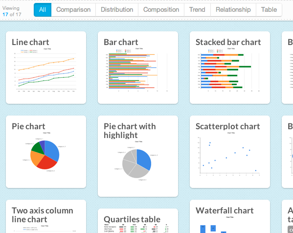
Introducing Chart Chooser -- V2!
Breaking Free of the One-Page Dashboard Rule
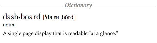
Conventional wisdom says that an executive dashboard must fit on a single page or screen. The argument hinges on a pair of assertions about this constraint: it provides necessary discipline to focus on only the most critical information; and it enables the audience to see results "at a glance."
10 Lessons in Treemap Design
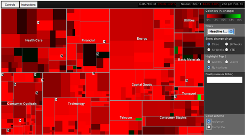
In the information visualization world, treemaps are on the rise…and justifiably so. Treemaps simultaneously show the big picture, comparisons of related items, and allow easy navigation to the details.