Gift Ideas for Data and Visualization Lovers: 2017

It's that time of year again. Thanksgiving is over, and the mad dash to find the perfect gift for everyone on your holiday shopping list is on. If you're anything like us, you've got a number of data visualization enthusiasts on that list that you just know are going to be particularly difficult to buy for. Thankfully, we're back with our annual gift guide created specifically for people who love data and visualization. Read on to find out exactly what to buy for your data-loving friends and family.*

Books

Just like last year, we're kicking this gift guide off with a selection of books that we think any data lover would enjoy. While there are so many excellent books on data visualization to choose from, these are a few of our favorites that were released (or re-released) this past year, with a few old classics thrown in as well. 

The Big Book of Dashboards: Visualizing Your Data Using Real-World Business Scenarios by Steve Wexler, Jeffrey Shaffer, and Andy Cotgreave

Semiology of Graphics: Diagrams, Networks, Maps by Jacques Bertin

Visual Journalism: Infographics from the World's Best Newsrooms and Designers by Javier Errea

Infographics: Designing and Visualizing Data by Wang Shaoqiang

Presenting Data Effectively: Communicating Your Findings for Maximum Impact by Stephanie Evergreen

Storytelling with Data by Cole Nussbaumer Knaflic 

Beautiful Evidence by Edward Tufte

Data Fluency by Zach and Chris Gemignani

Art

A few years back, Juice gave each of its employees a piece of sound wave art and it was a huge hit. One employee actually loved his painting so much that it now hangs permanently in Juice's Atlanta office. These pieces are not only custom and unique, they're absolutely beautiful visualizations of something that everyone loves: music.

For Kids

It’s never too early to start introducing the children in your life to the wonderful world of data, visualization, and technology. Instead of wandering through toy stores frantically searching for Fingerlings, consider instead one of the cuter, cuddlier, and less noisy distribution plushies from Etsy seller NausicaaDistribution. These visual guides to Star Wars and comic books make for great introductions for kids and teens to the wonderful world of visualization. And if you want to start them really young, check out the Code-A-Pillar from Fisher Price. It's a seriously cool toy that involves planning a path for the robotic caterpillar and getting it to follow that path using coding.

For the Data Lover Who Has Everything

What do you get for your data loving friends that already have everything on this list? How about the most customized visualization possible - one of their DNA! Give someone the ultimate information with either a 23andMe or AncestryDNA report that details his or her ancestry, food intolerances, and so much more! It will definitely be unlike any other gift they've ever received before.

These are just a few ideas for gifts for your data-loving friends. For more ideas and inspiration, check out our gift guides from previous years. And of course, have a very happy holiday season!

Related reading:

*Or for yourself. We don't judge here.


The Rise of Analytical Apps — Are We Seeing the Last Days of Dashboards and Reports?

dinosaur_comic.png

66,038,000 years ago, a massive asteroid smashed into the earth in what is now Mexico's Yucatan Peninsula. After this massive collision, it took only 33,000 years before the dinosaurs were entirely extinct — a blink of an eye in terms of the history of the earth.

This asteroid is considered to be the "final blow" after a series of ecosystem changes (other asteroids, volcanos, etc.) created a fragile environment for the poor dinosaurs. The climate changed, the dinosaurs died out, and the mammals took over.

Incumbent solutions for delivering data —dashboard and reporting tools— are facing their own "fragile environment." The big asteroid may not have hit yet, but it is only a matter of time. Here's why.

Exhibit A:

A thoughtful answer from an experienced Tableau user to the question “Why do people still use Tableau?”

We need to consider why (and when) people might stop using Tableau. My opinion is that Tableau has failed to realise two important things about their software and that if another company can solve this problem then Tableau could really lose out:

1. Companies need to create applications, not just reports

Yes, Tableau is interactive but you cannot use Tableau to make applications that write back to a database. It has maps, yes.. But you cannot use Tableau as the basis for an app like you might with MapBox (which has multiple SDKs for different platforms) or Leaflet.js for instance. Tableau is not designed for this, so if you need apps and not reports then it is not for you. You need a developer (or dev team) instead. This is a big gap in the product that other companies are also failing to see.

2. Tableau’s software does not directly generate revenue for (the majority) of their users

For a company to run several copies of Tableau desktop costs several thousand pounds. This is without the additional costs of Tableau Server or end-user licenses that you will need if you want your customers to use your hosted visualisations and dashboards. Any business that chooses to use Tableau to deliver interactive reports to its customers would need to consider passing some of that cost (or all of it) onto its end users. But when we’re talking about interactive reports, not applications, it is hard to justify data reporting as a stand-alone or additional cost.

That’s a real user wondering whether the paradigm of visual analytics tools for analysts, dashboards for executives, and reports delivered to customers and stakeholders is going to hold up for much longer.

Exhibit B:

Analytics vendors and market analysts are using language that leans more toward delivering "apps." 

Alteryx

Alteryx

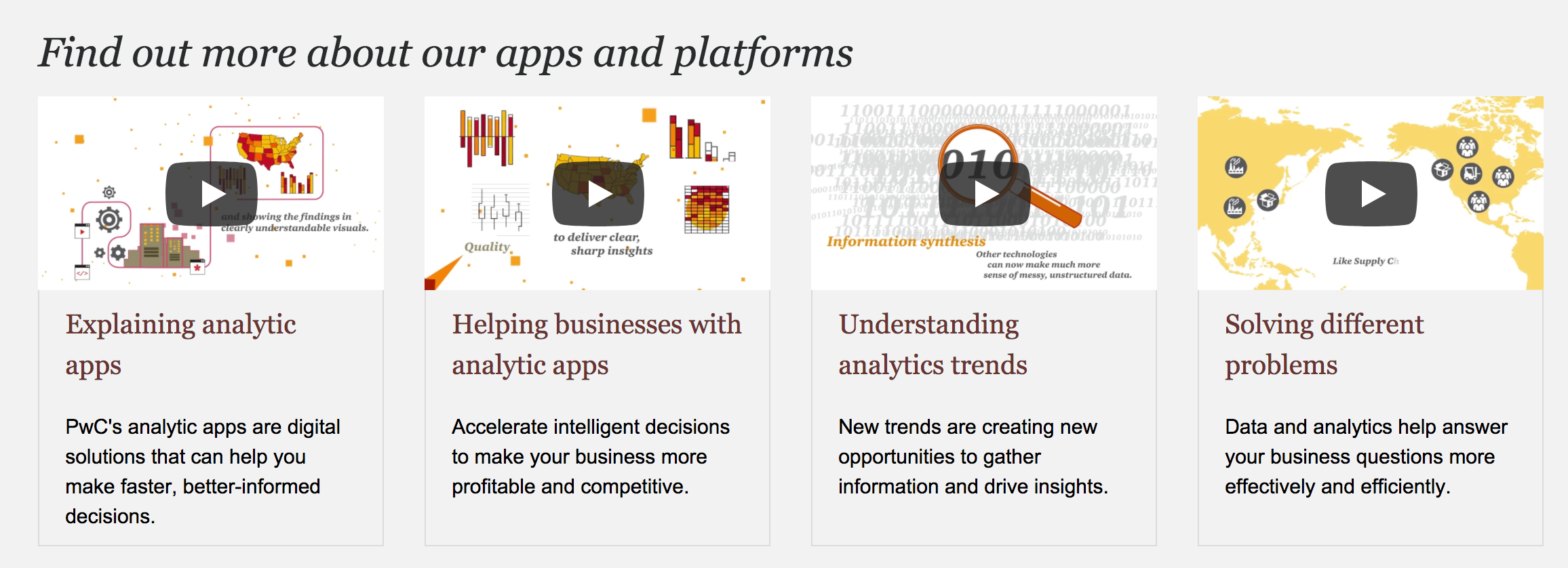
PwC analytical app marketplace

PwC analytical app marketplace

Infor

Infor

Gartner's IT Glossary

Gartner's IT Glossary

IBM Cognos

IBM Cognos

Is “app” more than a rebranding of a decade of data visualization tools? We think so. Here’s why we see analytical apps are on the way to taking over the BI world:

1. Apps have a purpose. A report or dashboard may carry a title, but it is less common that they have a clear and specific purpose. A well-conceived analytical app knows the problem it is trying to solve and what data is necessary to solve it. In this way they are similar to the apps on your phone — they solve a problem the same way a mapping app shows you how to get to the Chuck E. Cheese and a weather app lets you know if you need to bring an umbrella.

2. Apps make data exploration easy. I’ve spent a decade railing against poorly designed dashboards that put the burden on users to find where to start, how to traverse the data, and what actions to take. Good analytics apps willingly carry that burden. Whether we call it “data storytelling,” narrative flow, or quality user experience design, the app should deliver a useful path through the data to make smart decisions.

3. Apps are collaborative. Most business decisions are made as a group. If that weren’t the case, you’d have a lot fewer meetings on your calendar. Why should data-driven decisions be any different? Historically, reports and dashboards treat data delivery as a broadcast medium — a one-way flow of information to a broad audience. But that’s just the start: the recipients need to explore, understand, and find and share insights. They should bring their own context to a discussion, then decisions should be made. Our belief is that data analysis should be more social than solitary. It is at the heart of the “discussions" feature built into our data storytelling platform, Juicebox.

4. Apps lead to action. "What would you do if you knew that information?” That’s the question we ask again and again in working with companies that want to make data useful. Understanding the connection between data and action creates a higher expectation of your data. Analytical apps connect the dots from data to exploration to insight to action.

5. Apps are personalized and role-specific. The attitude of "one size fits all" is typically applied when creating a dashboard or report, and then it is up to individuals to find their own meaning. Analytical apps strive to deliver the right information for each person. How? By utilizing permissions for a user to only see certain data, automatically saving views of the data, and presenting content relevant to the user’s role.

The mammals took over because conditions changed, and the outdated species — with its size and sharp teeth — couldn’t adapt. Expectations are changing the analytics world. Consumers of data want an experience like they enjoy on their mobile devices. They don’t have the attention to pour over a bulky, unfocused spreadsheet, and they expect the ability collaborate with their remote peers. The climate has changed, and so too must our approach to delivering data.

If you’re still churning out reports, we can help you do better. Or if you’ve constructed a one-page dashboard, we can show you a different approach. Drop us a line at info@juiceanalytics.com or send us a message using the form below.

What's in a Juicebox: Discussions

What good is information if it cannot be shared and discussed? One of the founding pillars of Juicebox is communication; we aim to allow users, regardless of their familiarity with data analysis, the ability to easily identify and discuss important data points.

In taking on this challenge of what we call "The Last Mile of Business Intelligence", the question we must constantly ask ourselves is, "How do we make starting a conversation around data as easy as sending a text message?"

In order to solve for this, we have taken the knowledge gained from our 11+ years of designing and creating custom data applications and created an interactive data storytelling platform that helps everyday information workers make smarter decisions. Our goal for Juicebox is to reinvent the way people discuss and communicate data in the workplace and to their customers.

Our Discussions feature within Juicebox does just that by enabling those conversations around data in a method that is intuitive, quick, and effortless, especially compared to traditional processes. In the past when an insight was discovered within a spreadsheet, an analyst would have to send a report to a decision maker and ask him or her to review the finding. Not only was this process clumsy and time-consuming, the analyst and the decision maker were often on different planes in terms of data skill level. With Discussions, those conversing over the data can take a snapshot of the visual, mark it up, and download it in order to ensure the most relevant and important information is being shared. 

If you're interested in having conversations around your data, we would love to talk with you. Send us a message at info@juiceanalytics.com or click below to tell us more about what you're looking for. 

Data Storytelling Workshops, Part 2: Data Story Showcase

This is part two in a series on sharing Juice’s data storytelling method at various workshops around the United States. In part one, we talked about the highlights of teaching business professionals how to build insightful data stories in under an hour. Here we’ll showcase a data story that was built by one of our own Juicers who attended a workshop.

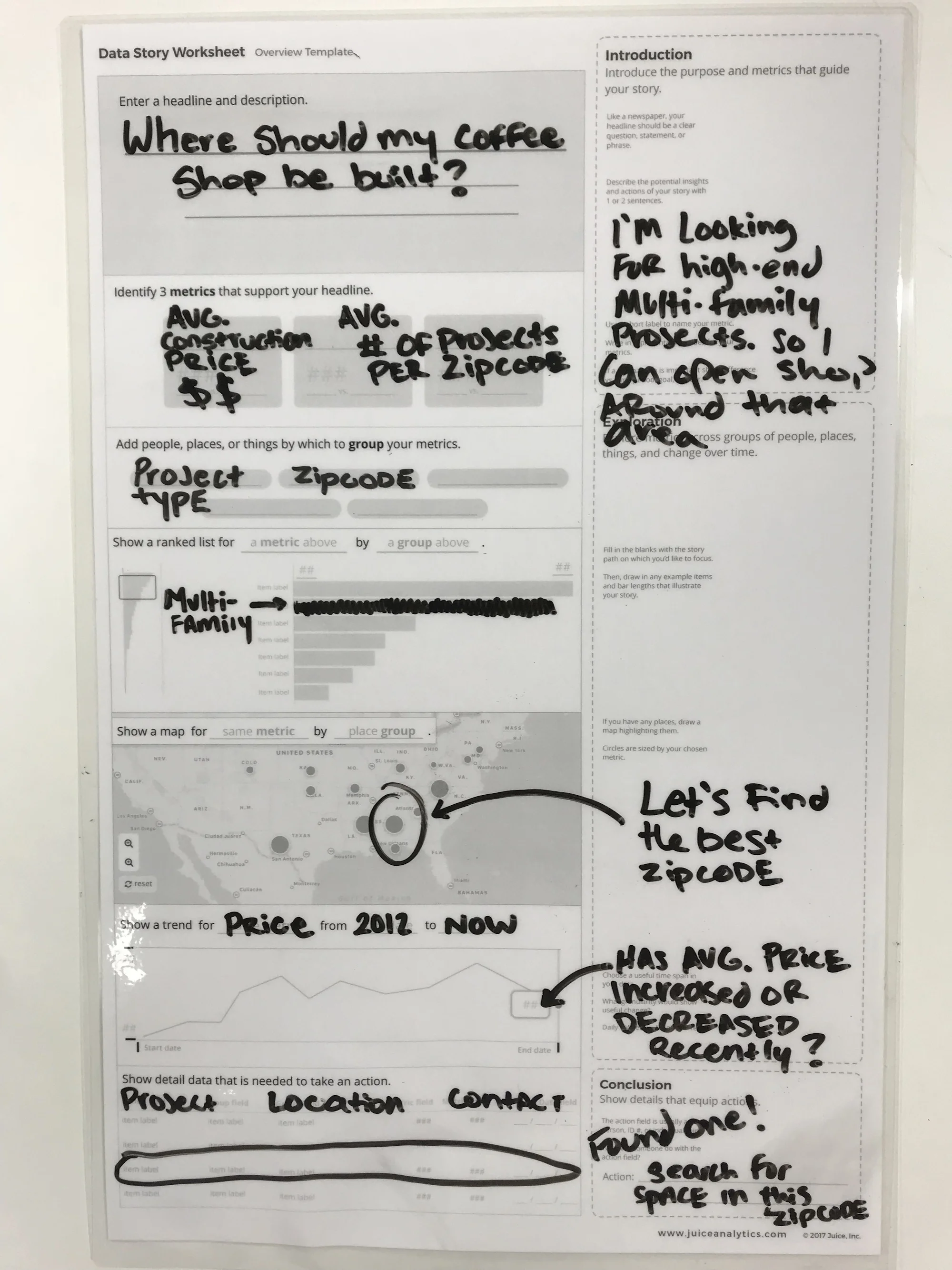
When creating data stories at Juice’s data storytelling workshops, we always start with a set of data from Nashville’s Open Data project. There are an infinite amount of data stories that can be created from a set of data like this that contains information on construction permits, location, cost, and type of building permit. For our data story prototype, we decided we wanted to know where to find construction projects for multi-family housing so that we could determine where to best build a cool new coffee shop.

giphy (12).gif

When creating our data story, it was important to us that we first give it a title. There are many different strategies that you can utilize when coming up with a title, but we decided to start with a simple yet profound question that would ultimately be answered by the end of the data story.

We find that in order to ensure that the data story being created is coherent and focused, it’s crucial to determine how each visualization contributes to the overall goal of the story. In this example, we wanted to have a high volume of people who enjoy a good cup of coffee and would be likely to visit our coffee shop. To display this in our data story, we would zoom into the map to browse areas around Nashville that are sized by the number of multifamily home projects currently underway in a given zip code.

Once we had selected a zip code that had a business-sustainable number of multifamily projects underway, we also wanted to check to see which way the number of projects in that zip code has been trending over the past 5 years. After seeing that the volume of projects in our zip code of interest had been positively trending over the past few years, we would search through the table at the bottom to find the largest one of these projects to build our coffee shop near so that we can maximize our chances for success.

IMG_8506.JPG

Want to know more about our data storytelling process? Send us a message! We're always happy to share our methodology or to answer any questions.


Data Storytelling Workshops, Part 1

The Juice team has been traveling around from conference to conference showcase our method of quickly and easily creating data stories from a data set. We got the opportunity to utilize Nashville’s Open Data project to source the data we used for the workshops. Attendees were divided into several groups and given the option to choose between several personas for whom they would build their data story. By focusing on a particular type of user’s goals, attendees were easily able to create questions that should be answered by the data. These questions or “goals” for their data story were written out on sticky notes by each group member and were shared with the entire group.

Juice Werkshops GIF 1.GIF

Once the goals for their stories were distilled into just 3 questions total, attendees chose metrics and dimensions that would function to best answer the questions that would achieve the goals that their personas wanted from the data story. Making decisions about building effective data stories typically take hours if not days. We were able to accomplish this in less than an hour and saw attendees leave with a full understanding of how a great data story is built for a particular audience or user.

Some workshop moments that were captured can be found in the 30-second video below:

Stay tuned for part two, in which we will showcase a data story that was created by one of our attendees. You won’t want to miss what he created in just under an hour with Juice’s guidance!

If you can't wait and want to see how you can start making your own data stories with Juice, send us a message using the button below.

Why We Prototype

At Juice, we’ve spent the last year relentlessly pushing to make it easier to build world-class interactive analytical applications, or "data stories.” This was an important change for us. In the past, like a design agency, we would create carefully-crafted user interface mock-ups with detailed descriptions of functionality and interactions. Anything we couldn’t show in a static picture we would describe in words. Now we can do something massively more effective: we can build a live, interactive prototype in the time it takes us to draw all those pictures.

Here are the most important reasons we felt it was necessary to be able to prototype with ease:

1. Non-designers don't speak the language of mock-ups

With a decade of experience designing analytical interfaces, we became adept at making the mental leap between a static mock-up and the live application it would become. Static mock-ups imply — but don’t show — interaction points. They suggest what the data may look like, but don’t try to accurately show the data. They highlight dynamic content, but can’t show it change.

Take the following visualization mock-up as an example. Can you tell:

  • How the orange button will change as you interact with the visualization?
  • What happens when you roll over the points?
  • Why the title indicates “4 categories”?
  • The image implies a lot of functionality to an experienced information design audience. That doesn’t help everyone else.
why we prototype image one.png

2. Uncover data difficulties early

Your data isn’t always what you think it is. It certainly isn’t as clean or complete as you might hope. By prototyping with real data, you discover some of the issues in your data that run counter to your assumptions. You may also find trends or patterns that reshape what information you want to show.

Recently we built an application for a client that delivers an assessment checklist. We expected that we’d be able to look at the average scores to see how well students were performing. But in reality, students didn’t need to submit their scores until they were complete (100%). As a result, all the scores were perfect. And perfectly lacking in insight.

Here are just a few of the common things we run into when we prototype with real data:

  • Missing values where data should be
  • Multiple date fields, sometimes with confusing meanings
  • Averages that need to be weighted
  • Unexpected behaviors captured in the data that create unexpected data results

3. Validate hypotheses about the story you want to tell

Designs are based on a lot of assumptions about users. How will users interact with the data? What data is important to them? What views will be most impactful?

Prototypes give us the opportunity to test these hypotheses.  We utilize a user experience tool called FullStory to see in detail how users interact with their data story. We can see where they get confused and where they focus their attention. We also ask pointed questions to ensure our assumptions are playing out as we expected.

Screen Shot 2017-10-11 at 11.43.53 AM.png

4. Gather user feedback to sand-off the rough edges

User feedback isn’t only helpful for the big things. It can help you understand whether you’re on track the small, but important, details. A great data application needs to communicate the meaning of the content, including everything from the metrics to the labels to the descriptive notes. A few things to look for:

  • Do users understand the meaning of the metrics accurately?
  • Do the descriptions and labels convey the right meaning?
  • Is the styling — color, contrast — work for users or is it distracting?
Screen Shot 2017-10-11 at 11.45.10 AM.png

5. Build buy-in and a bandwagon

Making the transition from standard reporting to an interactive data application can be a big step for some organizations. For example, it can be scary to imagine giving your customers the ability to explore data by themselves. What will they find?

Taking this big step sometimes requires baby steps. Prototyping is an easy baby step. If you can create a real, working version of a solution to put in front of senior leadership, it will go a long way towards helping them get on board. Now people don’t need to envision what is possible, they can see it.

Screen Shot 2017-10-11 at 11.46.18 AM.png

Interested in building a prototype with your data? Get started by sending us a message!

The Art of Data Storytelling: Structure

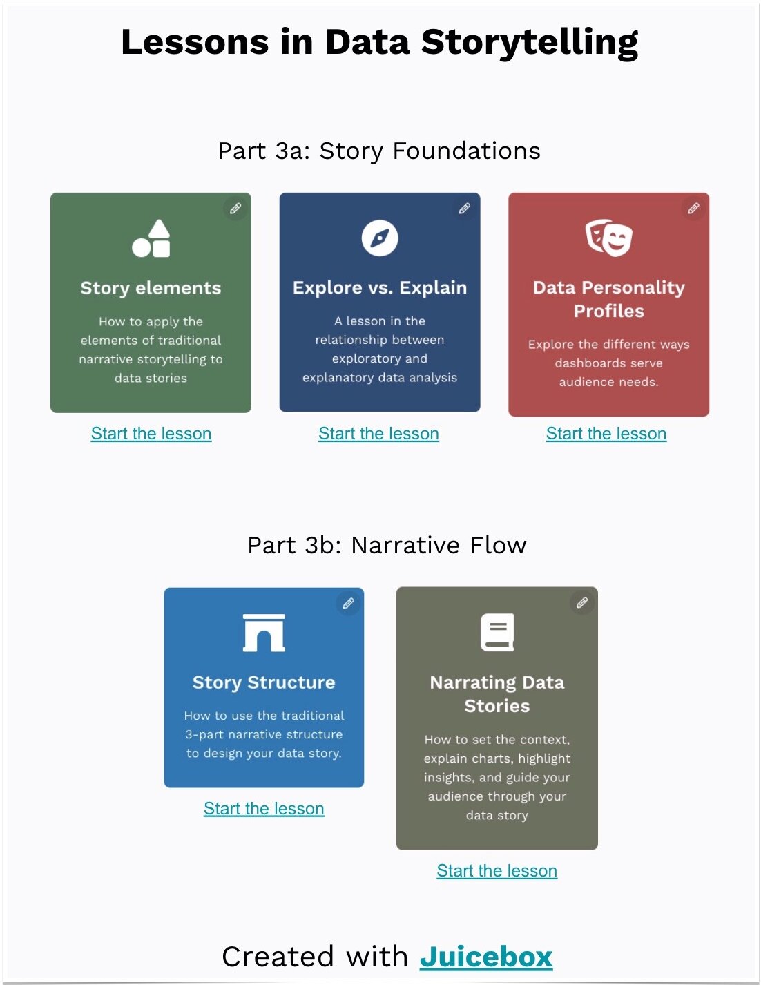
This is the second in a series of posts on The Art of Storytelling, a video series from Pixar that shares its storytelling methodology. In this post, we will be examining how the lesson on Story Structure can be applied to data storytelling. For part one on storytelling and character, click here

Introduction to Structure

While traditional storytelling and data storytelling are not identical mediums, there is quite a bit of overlap between the two, and many of the best practices for one can be applied to the other. Take for example the idea of structure when it comes to storytelling. Structure, or in simpler terms, “what do you want the audience to know, and when?” is hugely important when it comes to the practice of data storytelling.

It may seem counterintuitive to consider modeling your data presentations after traditional storytelling structure. After all, storytelling is an inherently subjective act. The storyteller is crafting something that helps the audience learn about a theme that the storyteller finds important, and consequently a moral that should be learned. Applying this to data can seem like enemy territory for analysts who feel that their job in presenting data is to “let the data tell the story.” It’s important to note, however, that the data doesn’t have an opinion on what is important. For example, I was speaking to an HR Analytics team recently and it was clear to me that they wanted to use data to share important lessons with the business. It was less clear that they felt empowered to do so because they felt the data should speak for itself. Data often needs a voice to give it meaning.

When creating the structure of your data stories, keep in mind that it often takes a while to get to the structure that works best for what you are trying to accomplish. That is why it is important to create something ‒ even in a rough form ‒ and get it in front of people who will give you feedback. Does it resonate and connect with the audience ‒ or is it more like the unpopular original structure of Finding Nemo? Without this knowledge, you’re more lost than Dory and Marlin ever were.

Story Beats & Story Spine

An effective way of organizing story structure is by utilizing story beats, the most important moments in your story, and story spine, a pattern into which most stories can fit. While your data story most likely won’t open with “once upon a time…” and end with “and ever since then…” the lesson can still be applied. Using a structure that is broadly familiar to audiences and hitting familiar story beats will help ensure that a data story leverages the hooks that storytelling already has in people. Your audience is looking for certain things in a data story, just like they would in a Pixar film. Who or what are the key players? What’s the conflict? How can it be resolved? Utilizing these when appropriate will make your data stories much more effective.

Act 1

The first act of a film serves to introduce the audience to a protagonist, establish the setting, provide information into how the characters’ world works, and introduce an obstacle that sets the rest of the story in motion.

In traditional dashboards and reports, this information is often missing and leads to users not knowing where to start. If your audience is going to go on a data adventure with you, they should start off by caring about the situation that exists. Data stories should start with a high-level summary that then lets users progressively and logically drill into more complex details and context.

Act 2

Pixar states that the second act of a story as “a series of progressive complications.” My favorite way of describing act two is “the part of the story in which you throw rocks at your characters.” Either way, what happens in the next part of your data story is clear: addressing conflict.

When it comes to data stories, act two is the back-and-forth exploration of the problem. In the traditional story spine they refer to it as “because of that…”; for analytics we call it “slicing-and-dicing.” Throughout act two of your data story you are showing your audience the drivers of problems and identifying any outliers.

Act 3

In traditional storytelling, the third act is the part of the story where the main character learns what she truly needs, as opposed to what she thought she wanted. The character has gone on a transformation along the course of the story, and that is evidenced in the final act.

This is much harder to pull off in data storytelling. In data storytelling, I believe the protagonist is the audience. Much like the main character, the audience needs to be transformed and understand something new and important. A satisfying story is when a problem is fixed and the world is set right in some way. Great data stories deliver that change -- but to do so they need to do more than change the audience’s perspective. They need to make the audience act on, not just discuss, this transformation.

Advice

The best bit of advice from the Pixar storytellers is simple: work backwards. This is how we do it at Juice: we consider what is the endpoint, the change or impact that we want to make on the audience, and then craft the story that can help get us there.

We know that crafting data stories can be a challenging process, and that’s why we’re here to help. If you’d like to talk to us about how we create data stories, send us a message at info@juiceanalytics.com or click the link below.

Q&A with Treasure Data: Everything You Ever Wanted to Know about Data Viz and Juice

This post originally appeared on the Treasure Data blog. 

Tell us at the story behind Juice Analytics. What’s your mission?

My brother and I started Juice Analytics over a decade ago. From the beginning, our mission has been to help people communicate more effectively with data. We saw the same problem then that still exists today: organizations can’t bridge the “last mile” of data. They have valuable data at their fingertips but struggle to package and present that data in ways that everyday decision makers can act on it. Even with the emergence of visual analytics tools, data still remains the domain of a small group of specialized analysts leaving a lot of untapped value.

Our company has worked with dozens of companies, from media (Cablevision, U.S. News & World Report) to healthcare (Aetna, United Healthcare), to help them build analytical tools that make it easy and intuitive to explore data. We published a popular book in 2014 titled Data Fluency: Empowering Your Organization with Effective Data Communication (Wiley) with a framework and guidance to enable better data communication. To bring our best practices and technology to a broad audience, we built a SaaS platform called Juicebox that enables any organization with data to create an interactive and visual data storytelling application.

Why is data visualization so important to an organization’s ability to understand its data?

Data visualization is one of the most useful tools in bridging the gap between an organization’s valuable data and the minds of decision makers. For most people, it is difficult to extract insights or find patterns from raw data. When we tap into the power of visuals to help us recognize patterns, data becomes more accessible to a broader audience.

For many of the organizations we work with, data visualization has the added value of uncovering issues with the data. Once you start visualizing trends and outliers, the weaknesses or mistaken assumptions about your data come to the surface.

What is data storytelling? How can it be useful to marketing professionals?

The term data storytelling has become increasingly popular over the last few years. We know that data is important to reflect reality — but absorbing data, even in the form of dashboards or data visualizations, can still feel like eating your vegetables. We all recognize the power of storytelling to engage an audience and help them remember important messages. People who focus on communicating data — like our team at Juice — feel that there is an opportunity to use some of the elements of storytelling to carry the message. Stories have a narrative flow and cohesiveness that distinguishes them from most data presentations.

However, data storytelling is different from standard storytelling in some important ways. For one thing, in a data story the reader is encouraged to discover insights that matter to them. One analogy I like to use is a “guided safari.” Data storytelling should take the audience to the views of data where new insights are likely to occur, but it is up to the audience to “take a picture” of what is more relevant to them.

In our experience, data storytelling is particularly valuable to marketing professionals. For internal audiences, data storytelling techniques can help you explain the impact of your marketing efforts to your stakeholders. For customer or prospects, data stories can be used to lend credibility to your marketing messages and enable deeper insights of your product.

What are essential tools for data storytelling?

The tools for data storytelling fall into a couple of categories: human skills and technology solutions.

The most critical skill you can have for data storytelling is empathy for your audience. You want to know where they are coming from, what they care about, how data can influence their decisions, and what actions they would take based on the right data. Knowing your audience allows you to shape a story that emphasizes the most important data and leads them to conclusions that will help them. Data storytellers must remember that an audience has a scarcity of attention and a need for the most relevant information.

At Juice, we’ve thought a lot about the capabilities that make data storytelling most effective — after all, we’ve created a technology solution that lets people build interactive data stories. Here are six features that we consider most crucial:

  1. Human-friendly visualizations. Your audience should be able to understand your data presentation the first time they see it.
  2. Combine text and visuals. There are lots of tools for creating graphs and charts. But data stories are a combination of data visuals flowing together with thoughtful prose and carefully-constructed explanations.
  3. Narrative flow. The text and visuals should carry your audience from a starting point (often the big picture of a situation) to the insights or outcomes that will influence decisions.
  4. Connected stories. In many cases, it takes more than one data story to paint the whole picture. Think of presenting your data as a, “Choose Your Own Adventure” book, in which the audience can pick a path at the end of each section to follow their interests.
  5. Saving your place. The bigger and more flexible a data story becomes, the more important it is to let the audience save the point they’ve arrived at in their exploration journey.
  6. Sharing and collaboration. Data stories are often a social exercise with many people in an organization trying to find the source of a problem and decide what they should do about it. Therefore, it is critical to let people share their insights, discuss what they’ve found, and decide on actions together.

Where do you see organizations struggling the most with managing and understanding the data they collect? What should they be doing differently?

A common problem is that organizations don’t truly understand the data they are collecting. Ideally, data is truth— it should allow us to capture and save the reality of historical events, such as customer interactions and transactions. However, more often than not, what the data is capturing isn’t exactly what people imagine. We find it useful when we can get a data expert in the same room as the business folks who will be using the data. A deep dive discussion about the meaning of individual data fields will often reveal mistaken assumptions or gaps in understanding. Working together to build a data dictionary can be invaluable as you continue to use data.

Data exploration is an iterative process. Answering one question will raise a few more. In this way, organizations will eventually identify where they lack understanding of their data. The faster you can iterate on analyzing and presenting data, the sooner you will resolve the issues.

Is all data visualization created equal? What do organizations need to know about finding the right type of visualization to help better understand their story?

Not all data visualization is created equal. There are visualization approaches — charts and graphs — that could be a good fit for your data and message and there are poor data visualization choices that will obscure your data. One mistake that we see is an ambivalence toward finding the right chart for the job. You may have seen dashboards that default to show data as a bar chart, but also give users the ability to pick a variety of other charts types. Why not choose the best chart to convey your data and unburden users from making any more decisions?

There are also well executed and poorly executed data visualizations. Good data visualization emphasizes the data over unnecessary styling, clearly labels the content and directs attention to the most important parts of the data.

From where you sit, how should organizations approach their data management – from collection to storing to analyzing?

We start from the end, then work our way backward. One of the biggest mistakes we see is organizations trying to collect and consolidate all the data they may possibly need in one place. These types of data warehouse projects quickly spin out of control with endless requirements and increasing complexity. It doesn’t have to be that way. Instead, we’d encourage people to start with three simple questions:

  1. What important action do we take today that could be better informed by data? Only include high impact actions where you have the data to answer the question.
  2. How would we present that data to the people who make take those actions? Most of the time it isn’t a data analyst who is going to be acting on the data on a day-to-day basis. Consider the simplest possible view of the data that would enable the end users.
  3. What data is necessary to deliver that view? Now you’ve narrowed down to just the critical data that is going to make an impact.

Once you’ve answered these questions for one specific action, you can go back and do it again for another.

What trends or innovations in Big Data are you following today?

Here are a few of the areas that are interesting to us:

  • Data narratives. Companies like Narrative Science are turning data into textual summaries. Like us, they are looking for ways to transform complex data into a form that is readable to humans.
  • The intersection of enterprise collaboration (e.g. Slack), data communication (e.g. Juice), and business workflows (e.g. Salesforce). Our goal isn’t just to help visualize data more effectively. We want people to act on that data. To do so, data visualization needs to connect to places where people are having conversations and into systems where people make business decisions.
  • Specialized analytical tools. The pendulum appears to be swinging away from do-it-all business intelligence platforms and toward best-of-class, modular solutions. Companies like Looker, Alteryx and Juice aren’t trying to be everything to everyone — but rather serve a specific portion of the data analysis value chain. We’ve found more and more companies that are looking for the best tools for the job, but require mobility of the data between these tools.

Do you have a question about data viz, data storytelling, or Juice that we didn't answer? Send us a message at info@juiceanalytics.com or fill out the form below.

New Ebook: 5 Strategies for Getting Started with Workforce Analytics

Picture this: you're an HR executive in a top healthcare organization. You love your job, and you're committed to providing the absolute best patient care possible. But with increased demands and a tightening resource base, doing so is becoming more and more challenging. How are you supposed to provide more when you're being given less?

Thankfully, there's a solution. Workforce analytics can provide invaluable insight into healthcare organizations that can have a direct impact on patient care and satisfaction. However, getting started with workforce analytics can be a confusing process. That's where we come in.

For years we've been working with healthcare organizations to address these very issues using workforce analytics. We've got some of the best minds in the industry tackling the same problems you face, and now they're sharing what they've learned about workforce analytics in our newest ebook. It will walk you through what workforce analytics are and the steps you can take to implement workforce analytics in your organization right away.

5 WA 3D.jpg

So if you're feeling ready to get started with workforce analytics, download the ebook for free now! 

Building Really Great Data Products, Phase 3: Make It Available and Scalable

Over the past few weeks, we’ve talked about what it takes to build really great data products. We started with how to go from a blank canvas to design the right data product. This week we want to touch on how to maximize the reach of your data product with Phase 3: Make it available and scalable.

There are two primary areas that facilitate scaling: 1) how the product connects with the target users, and 2) how the technology of the data product enables a higher volume of users and data.

Connect with your target

Just like any other product you might think of, data products need to be used by their target to accomplish their one job. If you followed our Guided Story Design™ process, you’ve already done most of the heavy lifting to connect with your target audience. But there are some post-design considerations that you need to make if you want to maximize how your data product connects with your target.

Before people will use a product, they have to know about it. When you begin the process of telling others about your product, don’t take the “build it and they will come” approach and toss it out there and see what happens. Instead, be intentional about how you introduce folks to your product. Begin with properly-crafted messaging about the problem your product solves. Frame it in a way that they understand how it helps them. Avoid “Hey look at this cool thing I made.” (i.e., what it does for you) and focus on “This application will point you to departments with high staff turnover” (what it does for them). You’ll want to make this message as simple as possible, focusing on the chief problem it solves and leaving discussion of features for later. Realize that if it takes you a paragraph to get someone to understand why they should use it, you’re gonna lose folks before they’ve even tried it out.

Once you’ve connected with your target in a way that makes them want to use the product, you have to make it so that they can actually start using it. Don’t forget that the first time they see the product, they’re going to have to build their own mental framework for how they engage with it; any structure you can put in place to help them with this makes onboarding so much better. Some tricks to lower the barrier to use include gradual reveal, simple introduction videos, and step-by-step guides on how to accomplish common tasks. We love to use new-user tours in our Juicebox apps, but these can also be accomplished through other less automated means (such as onboarding emails, training, or documentation).

In addition to those “push” onboarding ideas, you’ll also want to to consider encouraging “pull” engagement -- allowing your users to connect with you (for user feedback and support) and with other users (to discuss findings and questions). Believe it or not, interpersonal connections about the product will most certainly help them to connect better with the product.

Technology scaling and operations

The second component of scaling the data product is about how well the technology base on which it was composed enables more people to use more data. Because effective scaling is a very complex topic, we’re just going to briefly touch on it here with some scaling questions you’ll want to consider. As you ponder these questions, ask yourself how important each of these are to the success of your product.

Capabilities that make it easier to operate the product on a daily basis:

* Can I bulk add new users? Adding a handful of users by hand is no problem, but if you have to add dozens or hundreds, that’s no fun.

* Can I assign users to group access permissions? If different people need to have restricted access to different things, it may be more efficient to have permission groups to which you assign users so that there are no privacy slip-ups.

* Can I monitor what users are doing and how they’re using the data product? When you know who’s actually using the product you can better tune onboarding efforts.

* Can I load data using automation? Automation reduces error; if data quality is important, this may help.

* Do system resources (e.g., servers, data storage) autoscale to accommodate both growth and idle time? Making sure response times stay reasonable keeps users happier.

Capabilities that report on system health:

* Do I know who’s using the data product (now and in the past)? When you know who’s actually using the product and what they’re doing, you can better respond to questions and feature requests.

* Do I know if data loads ran successfully? Everything works perfectly… until it doesn’t. Then you’ll want to know.

* Can I effectively identify performance bottlenecks? If you know things that impact user experience, you can improve user experience.

* Am I notified when there’s a system issue? You won’t have to spend too much time looking for broken things before you’ll really appreciate smart issue notifications.

Capabilities that enable future improvements:

* Does my technology support my data product’s life cycle? Design → Develop → Production → Upgrade → Retire.

* Can I work on new features and bug fixes without disrupting production? Being able to make changes in a development environment prevents oh so many embarrassing moments.

* Can I reliably deploy a new release without breaking the data product? Don’t miss any pieces and don’t include pieces that don’t belong.

* Can I provide branded versions to my customers that have the same core code? White labeling and customer-specific configurations.

* Can I set up users that have access to different versions of the data product for testing purposes? Giving existing users access to pre-release versions can cure headaches before they happen.

All of these are important things to take into consideration when making your data product available and scalable. It can be a difficult undertaking, but it's not an impossible one. If you have questions or want to know more about the approach we take to build our data products, send us an email at info@juiceanalytics.com or send us a message using the form below.