The Consequence of Using Visualization Incorrectly

Data visualization can be a powerful tool when leveraged effectively, but what really happens when it’s done poorly? Well, how about a confused user? What about unnecessary support calls or just more meetings to explain what you’re trying to say?

Correct visuals help others understand the data and what it's telling them. When done well it’s like a whole new set of vocabulary for conveying your message. The reasons to avoid poorly presented information and investing in the time to do it right are as follows:

1. It can not only mislead, but lead people to the wrong decisions.

Misleading data can be completely unintentional, but no less damaging. When important data is left out of the visual, it leaves you open to making the wrong decision.

One thing to be aware of is whether or not certain data exists. There are times that specific data isn’t available and it’s important to know if you can get access to it or not. Missing data can lead to misunderstanding.

To make sure that you don’t mislead, start by thinking about your goals. What information is needed to make an accurate decision? Once you know what information you need and what data is available, think about the relationships between data points. Are those vital to understanding? If so, consider visuals that accurately display those relationships so that informed decisions can be made.

Also be sure that whatever visual you use has the right scale. Scale can easily distort information. It can also hide outliers that could actually be important data points to consider as context.

2. It can delay decision making, i.e. “not sure what this says, will look at it later.”

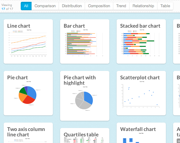
One of the biggest culprits of this problem is choosing the wrong visual. If you are trying to show relationships between data points, but use a bar chart instead of a scatterplot, it’ll take a lot of work to figure out where the relationships exist and what effect they have.

Also be sure to consider your audience. If they are more well versed in visualization, they may benefit from the use of more advanced visuals. But if not, keep it simple rather than alienating people.

The other culprit can be displaying too much or too little information. With too little information, your audience may be left wondering what the main point is and feeling like they need more information to form an opinion. With too much information, data can be overly complicated or cluttered and make it difficult to focus on the real story.

3. It can disengage some of your audience.

When visuals are confusing or difficult to follow or understand, users will trail off. They may decide to come back when they have more time to spend to “figure it out” or they may give up entirely. Neither is going to give you the results you want and can result in delayed, or misinformed, decisions. Some reasons that your audience might disengage are similar to issues above - a confusing visual, too little or too much information.

Ultimately you need to make sure your story is clear and easy to follow. Using visualizations incorrectly can cause you to lose your audience, lose the value in your data and ultimately lead to poor decision making.

For help with effective design and visualization, be sure to check out our design principles, particularly the sections on “guidance” and “audience-centric”.

Emotional Dashboards - Moving from confused to happy customers

Just like hearing that popular song from high school can elicit certain emotions, so too can a dashboard. Intuitively, the words “emotional” and “dashboards” don’t appear to go together. However, it's not difficult to imagine some four letter words being thrown around because “the numbers don’t make sense” or because your audience is frustrated that they can’t understand what you’re trying to say.

Sound familiar? When dashboards do not connect for your audience this is the sad intersection of lost clients, wasted time and dollars.

Today’s dashboards have the power to do more and be more than their predecessors. Just as modern web/application design marry utility, usability, mobility and beauty, so the same can be said for our information displays. Your organization’s data, when presented correctly, should command attention, start a conversation, compel action AND strike the right emotion.

How do you trigger the right emotions with a dashboard?

Frustration #1: Which information is most important!

Unfortunately, more often than not the heart of the designer’s message is lost among all the metrics and chart. In this flurry of enthusiasm to get something done, little attention is paid to guiding the user on how to consume the information, so they get what they need. Take a second look at your dashboard and ask what should be the first thing they see? Will they know it’s the most important.

Frustration #2: There’s too much detail!

Don't get caught in the myth that more is better. Your users probably have other responsibilities other than looking at your work all day. Give them the high-level path to follow, and let those users who need more info have the option to drill down into the details which can be collapsed under the high-level data point, or linked to an appendix, or included in separate report.

Frustration #3: The dashboard looks like Gaudi made it!

Overzealous graphics, too much color, images, etc can cause more harm then good.  Don’t get us wrong, Gaudi was an amazing artist, but, when displaying valuable analyses save your modernism impressions for some other endeavor. Be purposeful in how you use these elements.

There is no need to let those emotions go unchecked when it comes to displaying your dashboard results. To ensure you are triggering the right emotions and ensuring your dashboards are delicious, Download the emotion-filled Juice white paper “Designing Dashboards People Love”. Just updated to reflect the latest in Data Fluency.


The Myth of Flexible Reporting

Flexibility is essential, no doubt, to navigate life and work. Yet, flexibility is not always what is needed. Take for instance this NY Times Article, Too Many Choices: A Problem That Can Paralyze, which states that when we are faced with more options we tend to shut down or make decisions against our best interest. Often times, especially when dealing with data or making decisions, more flexibility is less helpful. It actually works against us in terms of work efficiency and cognitive load. When displaying information to the everyday decision maker, offering them the single best raisin bran choice vs. a list of choices is always best.

So what does this mean for your information sharing and reporting? Does your audience really want more reports or additional download options?

The answer is no. The myth in the reporting and dashboard world is that customers need or want more analytical flexibility and data. Sure there’s always some analyst that REALLY needs it, but more likely your buyer or end user wants your guidance on how to consume the information.   More choices always feels like a good idea on the surface until you begin to see the breakdown that occurs with users when they are drowning in reports or giving your interface that deer in the headlights stare. More reporting flexibility equals more support calls, more report requests, etc.

Here are a few reasons why your users might ask for more flexible reporting options. Be aware this is a HUGE opportunity for you to demonstrate your expertise with the data and guide them down the right path.

#1 Uncertainty - Your users aren’t really sure what they plan to do with the data, don’t know the problem they plan to solve or their business direction changes so often so they figure they need flexibility. This is an opportunity to show them the value of what’s in your data and the types of problems that can be solved. Provide certainty through instruction and guidance vs. feeding the uncertainty. This is a perfect opportunity to be a hero for customers like these.

#2 - Only one Shot -  Whether real or perceived, your customer perceives they only have one shot because of project timelines or budget reasons to solve for everything they need for the next 1+ years. In this case you need to teach them to be gourmets about the data and not think of it as a Vegas buffet. Getting every last bit of data won’t solve any problems. Help them solve a specific business problem with the data, in a timely manner (weeks not months). They will then have the credibility and leverage to ask for more resources. They’ll also have you to thank for it.

#3 - Do it myself - Do it Yourself (DIY) is fine. If they’re experts on your data and you have confidence in their capabilities and ability to come up with the right interpretation then let them go. However, be careful on this one. Often times it means that they don’t trust you to explain, guide or provide them the data they need or have asked for. Be sure to probe on this.  Has it happened right after you delivered a new set of reports? There are risks here of them coming up with the wrong interpretations or worse yet, you’re just a commodity provider of data.  

The place you want to be is like a personal shopper. You recommend, guide and instruct your users to the best path for them. If you just give them the cereal aisle, you’ll only be a cashier.  

When you guide them they know you care and are taking a REAL stake in helping them. Avoid the myth of flexible reporting. Check out Juice’s design principles, specifically the ones on guidance to offer up some ideas on how to implement guidance. As always, feel free to drop us a note with your thoughts or questions at info@juiceanalytics.com or tweet us @juiceanalytics.com.


More Apps; Fewer Reports

If you needed a phone number, would you use a printed phone book or an application on your iphone? As technology evolves we rely more often on apps (applications) to solve problems like finding a phone number.   The same (r)evolution needs to happen with reporting.  Reports are static and old-school like phone books.   Very rarely does a report solve a problem.  To ensure value for customers and users we need to make the transition from reports to apps.

Reports have their place.  Think annual report or some other regulatory obligation.  Your customers however really aren’t looking for more reports, despite their requests.  What they mean to ask for are apps that answer their questions and solve problems.  

We need to provide them a better, more modern way to stay informed and discuss data with others.  The everyday decision maker understands the notion of an app because they use them every day.   Much better than some dashboard or report you might create.  The idea of delivering apps vs. reports isn’t some unique idea.  

Gartner says that by 2017, 25 percent of enterprises will have an enterprise app store.   As apps take over enterprise solutions why shouldn’t reporting solutions follow suit. Probably closer to home is Google Analytics.  While it’s a dashboard and a way to generate reports, at its core it’s a series of apps.

  • A few other reasons we’re biased towards delivering data as apps vs. reports:

  • Creates a mindset of delivering big data in bite size portions.

  • Demonstrates your expertise or knowledge of the data since it’s more discrete.

  • Forces you to think mobile-friendly.

  • Allows you to use proven web design best practices

  • Permits a new way to talk about the data with your customers, i.e. solving problems vs. displaying information

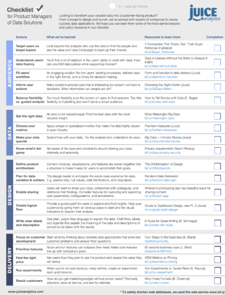
If you want to further your fluency in  “App thinking”, check out some of our other content which will offer some practical tips, especially our data product checklist.


"Gartner Says That by 2017, 25 Percent of Enterprises Will ..." 2013. 10 Aug. 2015 <http://www.gartner.com/newsroom/id/2334015>

Stop users from walking in circles, four rules to lead them like a tour guide!

A good tour guide always enhances our experience at art galleries, museums, historic sites or production facilities. We want to be guided.  Who has the time to put the hours into researching and becoming an expert on Picasso’s Blue Period or how Sierra Nevada brews beer on a national scale? We value and need others’ expertise. Your users are no different, they want to be guided by your expertise.

tour_guide_image.png

Think of the best tours you've been on. Most likely, the tour guide led your group in the best direction and was available for questions when needed. Great guides teach you about the topic at hand, but also leave room for self discovery. The same holds true for users of your data.

Turn your data into a guided tour

Rule #1: Don’t leave your users hanging. They should not walk away with unanswered questions or feel that they wasted their time. Respect the fact that your users have full-time jobs- they're not experts in your data.  When designing your data solutions, keep in mind that your product is the guide that helps facilitate the information experience, discussions and decision making.

Rule #2: Every story has a beginning. As the tour guide for your company, your job is to create a starting point for your audience. Mounds of information can be overwhelming to a user. Interesting and engaging tours set the stage and create a launching point for participants to begin their experience.  Don’t leave them confused with a barrage of charts and tables which lead them in circles!

image2.jpg

Rule #3: Gradually reveal more. This means you guide the user through data that you have designed with grouping like topics and themes to be studied one at a time. Leading the tour group through what you have prioritized as important information first. Reveal the high-level information, with the option to see more if desired.

The visual sequence of information is important in designing a data solution that not only guides the audience, but invites them to explore more and dig deeper into the details. Where you place key metrics, position charts and the amount of information you display will all make a big difference in how your audience will interact with the information.

Rule #4: Encourage exploration. The design of the tour, like your data product, should encourage your users to explore on their own as well. When developing your data product keep in mind that the user will want to see the big picture and then be able to engage with the information at a more detailed level. All filters you use to create the data product should provide immediate follow-up to provide continuity for the user.

As your tour concludes, you can see the results of the user’s experience.  But what makes data powerful is creating an experience for the user that informs, instructs, and leads to smart discussions, decisions and actions. Turning your data solutions into guided tours will not only help keep your audience’s confidence and attention, but will maximize your effectiveness in the market with users that feel they got the full value from your tour.

Find out more about effective data visualization, check out our full list of design principles. Also check out our book, Data Fluency.

Excerpted with permission from the publisher, Wiley, from Data Fluency: Empowering Your Organization with Effective Data Communication by Zach Gemignani, Chris Gemignani, Richard Galentino, Patrick Schuermann.  Copyright © 2014.

Guide Users to Understanding With Common Structures

When was the last time you vacationed in a new city? Remember that feeling of being lost until you had a couple landmarks under your belt or had to pull out your smartphone for guidance? Well it’s also important to provide that same guidance for users of your data products so they aren’t lost when trying to utilize it. For successful navigation, use structure to guide users on a path through your data product.

Laying out information is often undervalued, so we end up seeing a lot of visuals that are haphazardly placed on the screen. Sure, all the information is there for you - but can you understand it? Not every user will be an expert in the data, so that’s where guidance is important. Can people understand how the data points relate? If the way the data is presented doesn’t help the user’s understanding move forward, then the product has failed.

When deciding how to structure your information, consider the general structure of the underlying data. Related items should be near each other, there should be a clear entry point to reading the information, and important items should be more prominent. All these things can help move someone through the information and affect the way they approach the business problem.

Here are 3 Common Structures Used in Data Products:

The first structure is flow. This emphasizes your business’s sequence of events or actions across time. Generally, a flow structure will be based on an underlying process with a beginning and an end. Think about that vacation, you decide what new cities to visit, dates to stay at each location and create an itinerary or flow. All this data informs where your vacation will take you and when.

Relationships are another common structure for data. With information design, you  can emphasize relationships by using connective lines and descriptive labels so the user can understand how things are connected.  A common illustration of relationships are found in things like the metro or subway maps that you rely on as a traveler to get around the city.

Finally, grouping as a last resort for structure. Grouping data categorizes information and creates hierarchy. By grouping similar things you can help bring order and logic to otherwise haphazard information. While traveling, figuring out where to get your next meal may help you understand grouping. You can use your smartphone to check out venues by categories like type of food, ethnicity, neighborhood, price or reviewer ratings.

By keeping these structures in mind, you ensure that your users are guided down a path. This leads to better understanding and ultimately, action.

Find out more about effective data visualization from our book, Data Fluency.

Get a free excerpt from the book!  (enter code: FLUENCY-EXCERPT)

Excerpted with permission from the publisher, Wiley, from Data Fluency: Empowering Your Organization with Effective Data Communication by Zach Gemignani, Chris Gemignani, Richard Galentino, Patrick Schuermann.  Copyright © 2014.


Metrics that really matter - common pitfalls to avoid

No matter what business you are in, keeping a competitive edge is essential. Being able to evaluate your performance and extrapolate the next steps is essential to a successful  business model. Just like a judge at the Westminster Dog Show, you will need a host of metrics to scrutinize a good performance.

So what is the key to winning in the dog-eat-dog world of business? Tracking and analyzing of metrics, of course. Your metrics can create focus and alignment in your company by providing clarity to what improvement looks like. Although be warned, they can also lead a company astray if not carefully selected.

5 Common pitfalls to avoid when choosing metrics:

Historical conventions translate into blindly following conventional wisdom or history without giving thought to the implications. In an ever changing business climate, you stay on top by being adaptive and responsive.  A Westminster judge is not going to vote for the posh poodle just because the previous two winners were poodles.

Simplistic metrics means taking only at face value what data gives you. Just because the data is easy to track does not mean it will lead your business to the front of the pack. For example, in a two day dog competition with many different breeds of dogs, easy to obtain metrics like weight and height, would not be enough to help you discern a deserving winner.

Complex metrics are contrived metrics that combine data from many sources. If your goal is to shape company behaviour to increase success, then it is imperative for people in the company to understand how the metric was created and trust the data source. Otherwise they may be skeptical of the metric. The metrics for Best in Show are transparent for all involved. This is imperative when you are dealing with dogs of all shapes and sizes. The dogs are first judged within by metrics within their breed. As the competition continues grouping is based on the jobs the dogs were bred to do.

Too many metrics, also known as data overload. Typically, this occurs when you are working with dozens of key metrics because they all mean something, but they may not all deserve to be called “key”. This is why grouping and filtering down is important.  If you a had to choose the winner of Westminster on day one with all 2,500 contestants present, that would be overwhelming!

Vanity metrics are just what you think they are. These are the metrics that make your organization look good, but don’t necessarily tie to important or relevant outcomes. The dashing dachshunds might look dapper on the runway but how well did they perform in the other areas of competition?

By avoiding these pitfalls, you can create data products that will lead your team to meaningful decisions and actions.  Accurate tracking of data and analysis is the key to your company unleashing its earning potential and staying ahead of the competition.

Find out more about effective data visualization from our book, Data Fluency.

Get a free excerpt from the book! (enter code: FLUENCY-EXCERPT)


Excerpted with permission from the publisher, Wiley, from Data Fluency: Empowering Your Organization with Effective Data Communication by Zach Gemignani, Chris Gemignani, Richard Galentino, Patrick Schuermann.  Copyright © 2014.

Goals and Metrics, like Peanut Butter and Chocolate

Goals are defined by metrics. Metrics are given meaning through goals. They go together like peanut butter and chocolate.

That’s why we decided to integrate goals into our customer reporting and data visualization platform, Juicebox. To help people make better use of data, we needed to think about how people set, track, and update goals. In the process, we tried to answer the why, who, what, how, when, and where of using data-driven goals.

Why do we set goals?

Goals help focus an organization and connect everyday activities to a larger purpose. Goals are a communication mechanism to emphasize what’s important. They define the gap between the way things are now and where the organization wants to be. Goals establish priorities.  

Who sets the goals?

Commonly, goals are set by the highest level of management and passed down to the rest of the organization. However, its not unusual for management to be disconnected from the constraints and realities of the metric and goal. The best people to set goals are those who know the context, can be accountable, and have access to the resources to impact change. It is also important that there is transparency in who set the goals and why it was defined as it was.

"The early models (some still common today) focus on management. Goals are established by top executives and then communicated down into the organization. Therefore, goals are not always meaningful to individual contributors and employees doing the actual job." - Goal Science Best Practices, BetterWorks

What is a well-defined goal?

A common framework for setting goals is the SMART criteria. Goals should be: Specific, Measurable, Achievable, Relevant, Time-bound.

How should we set goals?

A metric-defined goal needs to find a balance between realistic improvements and previously-unattainable ambition. Finding this range requires analysis. Consider industry averages, historical performance, and expert opinions. Top performers can lend guidance as to what’s possible but extreme outliers will set an unrealistic bar.

When should goals be evaluated and re-evaluated?

Choosing when to update your goals depends on the pace of your business and how quickly you can track progress. You want to update goals as conditions change and as you bring in more information to know whether you’re expecting too much or too little. At the same time, goals without some sense of permanence are easy to ignore. Practically speaking, many organizations are evolving from annual goals to quarterly reviews to ensure better responsiveness to changes.

Where should goals show up?

Our Juicebox platform enables the kind of interactive reporting that people can actually understand, use, and act on. To make data more useful, we knew it was important to allow our customers to build goal-setting right into their apps. We paired our visualizations for showing key metrics with an expandable drawer to let users set their own goals.

Here’s what we did to implement a feature that would make goals part of everyday data usage:

  1. Enable permissions to allow specific user types to have the ability to set goals. The rest of the users see the goals but can’t make changes.
  2. Goals are paired with information about the key metrics (e.g. comparison to industry average, trends) to guide SMART goal-making.
  3. The user-defined goals become an integral part of the report — not only are key metrics compared to the goals, but other results throughout the interactive report are keyed off the goal.
  4. Enable collaborative discussions about the goals right inside the Juicebox application.

To get a better glimpse at Juicebox and the goal setting features, schedule a demonstration via this link.

When good enough reporting is OK

OK is a bad word in our house.  Its like “fine” or “satisfactory”.   Nothing troubles me more  than hearing my wife say “it's fine”.  OK or good enough always means there’s room for improvement.  

Good enough is OK in reporting and dashboards when you and your audience know:

  • there is an improvement plan to move beyond good enough
  • you’re testing the waters and actively engaged in getting feedback
  • there’s a bunch of iterations planned
  • you’re available for Q&A

More specifically for reporting or data presentations good enough usually applies when:

  • there are new metrics or measurement is evolving; e.g corporate sustainability metrics
  • its a 1.0 report with a 2.0 planned and funded in the near future

The worst aspect of good enough is that it rarely triggers the desired response. Think about the last time you saw a restaurant health certificate that was a “B”.  It's good enough to still be in business and selling food, but what was your response to seeing it?  Do you think it was the response the restaurant wanted?

When displaying data either in a report or presentation you should consider if “OK” is a desired response.  What if after sharing a presentation that you put hours of effort into, your audience’s reaction was, “It was OK”? How would that feel? Consider the last mile of your efforts to ensure they're received as more than good enough.

When is good enough NOT OK?

Here are a few situations when sharing data where good enough is never OK:

  • customer annual or quarterly performance reviews
  • supplier/franchise performance reporting
  • launching a new product or report offering

In these cases you have a limited window for success.  There aren’t chances for a do over with your audience. You want the intended emotional response and not the indifference associated with good enough.

How do you avoid OK?

You avoid OK by being tuned into your audience.   See Cole’s recent post on audience for some tips. The better you “get” your audience the more likely you’ll exceed good enough.  For some specific tips on audiences also check out the Audience-centric design principles section listed here about midway down the page.   

Let us know if we've missed some instances of where good enough is OK.  We'd love to hear from you.

4 game changing strategies for information discrimination

We’re pretty excited about the upcoming Women’s World Cup as well as all the soccer (football) games we’ll get in Atlanta and Nashville this Summer.

All these matches made us think how much authoring data for an audience can be like a preparing for a game or a PK (penalty kick). Distractions and extra information are your enemy. As a data author intent on having your audience understand (get) what you’re doing, you need to prioritize what information really matters. Here are some thoughts around keeping focused and having the biggest impact possible on your audience:

1. Find the heart of the  issue - your data product should have a core theme which is based on the essence of the issue. For the sales team the big question might be “How can we generate more leads into our pipeline?” Honing in on that core question can help you eliminate information that isn’t helpful.

2. Ask a better question - “What would you like to know?” might generate a long list of responses. To help narrow down the list, follow that question with “What would you do if you knew this information?” This second step will help you decided what data is actually needed.

3. Push to the appendix - Of course there will still be times when you are required to include all the data people might want to see. Utilizing an appendix can ensure the information is available but doesn’t detract from the data product’s main purpose.

4. Separate reporting from exploration - Reporting and exploration are two separate processes. Know which purpose you are designing for. Just remember, tools designed for reporting should address specific questions and stay on topic. On the other hand, tools designed for exploration or analysis will provide a broader palette for users explore a variety of data.

Staying focused and incorporating these strategies will help you create data solutions that are useful, productive and interesting. After all, isn’t that the goal :-) ?  Enjoy the matches this summer!

Find out more on effective data presentation strategies from our book, Data Fluency.

Get a free excerpt from the book!


Excerpted with permission from the publisher, Wiley, from Data Fluency: Empowering Your Organization with Effective Data Communication by Zach Gemignani, Chris Gemignani, Richard Galentino, Patrick Schuermann.  Copyright © 2014.